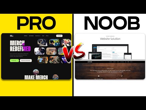
Selecting the right design studio website layout is crucial to both communicating your brand’s image and enhancing user interaction. It sets the stage for showcasing your portfolio, services, and expertise in the most effective light. A well-thought-out website layout can highlight your design studio’s strengths and core competencies, while poor choices can lead to user confusion and a high bounce rate. We understand the importance of carefully planning your site’s structure to achieve the desired impact on your visitors.
The key to choosing an effective website layout involves understanding the needs of your target audience and the goals of your website. Whether the aim is to display a vast array of work or provide detailed service information, the layout should be intuitive and lead visitors naturally through the site. We take into account responsive and adaptive designs which ensure a seamless experience regardless of device, as well as considering navigational components and design elements that reflect our brand’s aesthetic while prioritizing user experience.
Key Takeaways
- A successful website layout aligns with the brand image and goals, enhancing user interaction and experience.
- Thoughtfully planned structure with responsive design ensures accessibility across all devices.
- Intuitive navigation, coupled with cohesive design elements, increases user engagement and satisfaction.
Understanding Website Layouts
When we approach the creation of a website, selecting the right layout is crucial. It serves as the skeleton that holds together the elements on a webpage, directly impacting usability and aesthetics.
The Role of Grids in Web Design
The grid is a foundational element in web design that helps us organize content on a page. A grid layout breaks the space into columns and rows, creating a framework upon which to align text, images, and other elements. There are types of layouts that employ grids in different ways. For instance, a symmetrical grid lends a sense of balance and order. In contrast, an asymmetrical grid can convey movement and dynamism, often used for more creative or cutting-edge designs.
Recognizing Different Layout Types
As we scan through various websites, it’s evident that there are numerous types of layouts. A commonly adopted layout is split-screen, which divides the page layout visually into two main sections, allowing us to present dual important pieces, like images and text, side by side. Each layout has its strengths, and recognizing the appropriate type for a design studio’s needs is a skill we’ve honed. It’s not just about aesthetics; it’s also about ensuring that the layout responds to user behavior and expectation.
Planning Your Site’s Structure
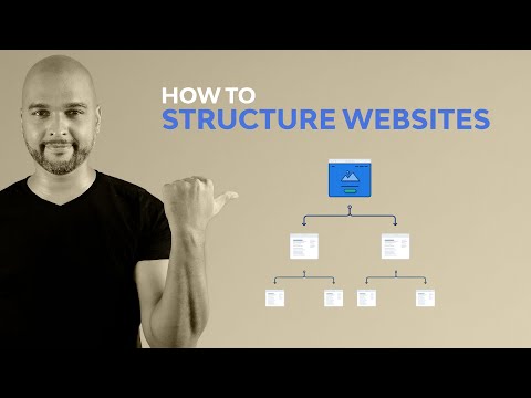
Before we dive into the details, we must acknowledge that a well-planned site structure is fundamental for both user experience and SEO. Our site must provide a clear path for navigation, and the hierarchy must reflect our most important content.
Defining Your Website Goals
The first step in planning your site’s structure is to clearly define the goals of your website. These goals will guide every decision we make about our site layout and user journey. For example, if our main goal is to showcase a portfolio, our site structure should emphasize visual elements and easy access to our work.
Creating an Efficient Wireframe
Once our goals are laid out, we’ll create a wireframe, which serves as a blueprint for our website design. This wireframe should lay out the hierarchy of our site in a clear and straightforward manner. It’ll include the placement of the navigation bar and other key elements to ensure that users can find what they need without unnecessary clicks. Our wireframe acts as the foundation for a user-first design, making sure that our site structure translates into a positive experience.
Navigational Components

We ensure that our design studio’s website layout is intuitive and user-friendly by focusing on its navigational components. These include clear navigation menus and the thoughtful incorporation of icons and lists to guide users through the website effortlessly.
Utilizing Navigation Menus
Navigation menus are the backbone of website navigation, serving as vital signposts for visitors. A well-structured navigation menu acts as a roadmap to the important sections of our site. To create an effective navigation menu, we focus on:
- Hierarchy: Place the most important items in prime positions, such as the top-left corner or center of the menu, which naturally draw the eye.
- Simplicity: Keep the number of items to a minimum to avoid overwhelming our users and make it easier for them to find what they’re looking for.
Incorporating Icons and Lists
Icons are powerful tools that complement our navigation by offering a visual shorthand to improve user experience. When we use icons in our navigation:
- We choose icons that are widely recognized and represent the content they link to for immediate understanding.
- We combine icons with text labels to eliminate any ambiguity, ensuring every user grasps their meaning.
Furthermore, we structure information into lists, particularly in our navigation’s dropdown menus, to create a clean and efficient design that serves as a focal point for users:
- Lists are organized to reflect the logical flow of content, guiding the user’s journey on our site.
- We format lists for quick scanning, using bold and italic styles to highlight particularly important or relevant items.
Design Elements and Aesthetics
In crafting a website layout, choosing the right design elements and aesthetics is pivotal. Our focus is on determining an appealing color palette, selecting fonts that reflect the brand’s voice, and strategically incorporating imagery and icons.
Choosing a Color Palette and Fonts
When we select a color palette, it’s crucial to consider the brand identity and the emotional impact colors have on visitors. Colors should align with the brand’s message, be visually harmonious, and improve user experience. Applying color psychology can enhance the design’s effectiveness; for instance, blue often instills trust, making it a popular choice for financial institutions.
Picking fonts also demands attention to detail. We consider fonts that ensure readability and accessibility while resonating with the brand’s personality. A combination of a serif font for headings and a sans-serif for body text often yields both aesthetics and functional balance.
Incorporating Imagery and Icons
Imagery plays a significant role in communicating a brand’s story and values. High-quality, relevant images can capture attention and aid storytelling. We utilize images that are contextually appropriate and enhance the content rather than serving as mere decoration.
Icons are used to simplify navigation and convey information efficiently. Specific design principles guide us in choosing icons: they must be clear, recognizable, and consistent in style throughout the website. For example, a magnifying glass icon universally signifies a search function. Buttons are similarly styled to complement the overall design while standing out as actionable elements.
Responsive and Adaptive Designs
When we approach web design, selecting the right layout is crucial. We must decide between responsive and adaptive designs based on our specific needs and audience.
The Importance of Responsive Design
Responsive design ensures that our website is accessible and provides an optimal experience across a wide range of devices. By using flexible grids and CSS media queries, we enable layouts to adapt automatically to the viewing environment. We favor a single-column layout for smaller screens to maintain readability and ease of navigation. Conversely, a full-screen layout is often reserved for desktop displays, immersing the user entirely in our content.
Examples of Adaptive Layouts
Adaptive design, on the other hand, uses distinct fixed layout sizes. When we design adaptively, we tailor our site to specific device resolutions. For example, we might create a layout for mobile (320 pixels), one for tablets (768 pixels), and another for desktops (1024 pixels or larger). This approach ensures that our layouts will meet the particular constraints of each device, though it often involves more development time and resources compared to responsive designs.
Interactive Elements for User Engagement
In our design studio website layouts, we focus on integrating interactive elements that are designed to enhance visitor engagement and guide users toward our goals. These elements play a crucial role in creating a dynamic and effective user interface.
Effective Use of CTAs
Call-to-action (CTA) elements are the key drivers of user interaction on our websites. We ensure that each CTA is strategically placed to catch the user’s attention and encourage action. Whether it’s signing up for a newsletter or downloading a resource, our CTAs are crafted with compelling language that aligns with our overarching goals. For instance, “Start Your Free Trial” leverages urgency, while “Learn More” nurtures curiosity.
Forms and Call-to-Action Buttons
Forms serve dual purposes: they collect valuable visitor information and act as an interactive element that increases engagement. We make our forms user-friendly and succinct, asking for only the most essential information to ease the submission process. Our CTA buttons accompanying forms are bold and clear, with verbiage like “Submit” or “Join Us” that leaves no doubt about the next steps. This clarity in communication ensures a seamless experience, contributing to higher engagement rates.
Examples of Exceptional Website Layouts
We understand the importance of a well-designed website layout for any online presence. It’s the first impression that can either invite engagement or drive visitors away. We’ll walk you through standout examples from ecommerce and portfolio websites that encapsulate effective design principles.
Showcase of Ecommerce Websites
Ecommerce websites require a layout that not only showcases products effectively but also provides a seamless shopping experience. Let’s look at a couple of examples:
-
Functional Simplicity: An ecommerce site can excel with a clean design that puts products front and center. Amazon, for instance, uses a straightforward layout that allows users to scan and filter through an extensive catalog with ease. Despite the volume of products, customers can easily navigate their search results and product categories.
-
Visual Storytelling: Another example is the refined aesthetic of Allbirds, whose website layout embraces spacious design, allowing high-quality images and product details to take the lead. The user’s journey from discovery to checkout is intuitive, reinforcing a hassle-free shopping experience.
Inspiring Examples from Portfolio Websites
Portfolio websites, on the other hand, are tasked with showcasing work and talent in a compelling and professional manner. Successful design studios frequently employ these strategies:
-
Creative Freedom: Design studio websites like Pentagram use their homepage as a canvas to display their creativity. Wide margins and bold project imagery speak for themselves, with each project conveying the studio’s proficiency and style diversity.
-
Interactive Experience: Some studios create a memorable experience via interaction and animation. For example, the website of designer Daniel Spatzek features engaging animations that introduce visitors to his work, making the portfolio an interactive exhibition of capabilities and innovative design solutions.
In both ecommerce and portfolio layouts, it’s clear that thoughtful design facilitates a meaningful and impactful user experience. Whether showcasing products or creative work, these examples excel in merging aesthetic appeal with functionality.
Choosing the Best Layout for Your Needs
When selecting the right layout for a design studio website, we focus on specific features that align with the site’s goals and audience. It’s crucial to select a layout that not only looks appealing but also enhances the user experience and meets functional needs.
Considerations for Magazine and News Sites
For magazine and news sites, choosing a magazine layout that facilitates easy content discovery and readability is essential. These sites often have a wealth of articles, photos, and videos that need to be organized in a way that readers can navigate intuitively. A grid layout works well, allowing for a clean structure that can incorporate breaking news, feature stories, and other media. Dynamic content areas are important as well; they should update regularly and feature the latest or most popular content to engage readers quickly. Infographic representations or thumbnail images can accompany articles to provide visual cues about the content, making the site not only informational but visually compelling.
Architectural and Educational Website Layouts
Architectural and educational sites demand a layout that represents professionalism and clarity. The goals here are often to showcase a portfolio or to provide educational resources. Architectural sites benefit from a gallery or portfolio layout, presenting work with high-quality images in an organized fashion. Using hover effects can give a preview of projects before visitors click. Educational sites need a hierarchical layout that students and educators can navigate easily, with clear categories and a logical structure. Bold headings and bullet lists can break down the information into digestible chunks. For both types of sites, accessibility and ease of navigation are priorities to ensure that all users, regardless of their familiarity with the site, can find what they need efficiently.

