In the realm of UI design, typography plays a critical role, affecting not just the aesthetics but also the usability of the digital products we create. A Typography UI Kit encompasses a comprehensive set of typefaces and typographic styles designed to ensure coherence and readability across a digital interface. With these kits, we can quickly implement a harmonious and branded typographic hierarchy, ensuring that text is not only legible but also engaging.
Central to our process is the selection and pairing of typefaces. This not only involves aesthetics but also an understanding of how different fonts convey different emotional responses and functionality when used within a UI. From headers to body text, each element within the typography UI kit must be carefully curated to provide scalability and versatility. By incorporating text in UI components intelligently, we ensure that our interfaces meet high standards of quality and are accessible to all users.
Key Takeaways
- A Typography UI Kit standardizes typefaces and styles to enhance UI consistency and readability.
- Choosing the right typefaces involves both aesthetic and functional considerations to ensure text is effective.
- Accessible typography within UI components is vital for inclusive design and a quality user experience.
Understanding Typography in UI Design
In UI design, typography is a crucial element that affects both the aesthetics and functionality of a product. Proper use of fonts, typefaces, and type scale ensures that the information hierarchy is clear and the content is legible.
The Basics of Typography
Typography is the art of arranging text in a way that makes written content readable and appealing. When selecting a font for a UI kit, we consider its design implications and compatibility with the overall design language. Typefaces come in varied styles, such as serif or sans-serif, which can evoke different emotions and user reactions. Scale is equally important; it helps to create visual harmony and guides the user’s attention to where it’s needed most.
Typography and UI Hierarchy
Hierarchy is established through the use of different fonts and weights, such as bold or italic, to differentiate pieces of information based on their importance. Contrast is vital, as it separates text elements from one another and from the background. For instance, using a bold typeface for headings can set them apart from body text, making the UI more navigable.
Typography and Readability
To maximize readability, we pay close attention to legibility and the fine details of typography. Good line spacing, often called leading, improves the readability of large blocks of text by ensuring that lines of text are spaced in an optimal way. Additionally, appropriate letter spacing, or tracking, can enhance or impair a user’s reading experience, especially on digital platforms. When incorporated properly into a UI kit, these elements ensure that the text is user-friendly and accessible.
The Elements of a UI Kit
When we discuss the elements of a UI kit, we’re referring to the comprehensive set of tools that designers use to create a cohesive user interface. These elements include a variety of components, icons, and design principles that ensure visual and functional harmony across a product.
Components and Icons
Components are the building blocks of UI kits. They can range from buttons and input fields to navigation bars and modals. Each of these elements serves a specific purpose within the user interface and is designed for reuse and modularity. Icons, on the other hand, are visual representations that support the functionality or provide a visual cue. They should be intuitive and consistent in style to aid recognition and usability.
- Components: Buttons, text fields, checkboxes
- Icons: Search magnifying glass, user profile silhouette, gear for settings
Design Systems and Consistency
A design system within a UI kit acts as the single source of truth. It ensures that we maintain consistency throughout the user interface, which is essential for creating a seamless experience for users. Consistency in design elements such as typography, form components, and navigation structures builds trust and reduces confusion.
- Consistency Guidelines:
- Typography: Maintain font consistency across headers and body text.
- Form Components: Utilize the same style for text fields, checkboxes, and radio buttons.
- Navigation: Use consistent iconography and labeling for menus and tabs.
Color and White Space Management
Color schemes in a UI kit play a crucial role in the visual hierarchy and brand identity. We use color to draw attention, indicate interaction, or convey status messages. Meanwhile, white space — or the lack of graphical elements — is not merely empty space. It’s a powerful design element that improves readability, creates balance, and focuses on user attention where it’s most needed.
- Color Schemes:
- Primary Colors: Brand colors for prominent elements.
- Secondary Colors: Accent colors for secondary actions and highlights.
- White Space Usage:
- Margins and Padding: Ample space around components.
- Gutter Space: Space between columns in a grid.
Selecting and Pairing Typefaces
Careful selection and combination of typefaces are pivotal in creating a visually harmonious and functionally clear user interface. We must consider how font weights, styles, and pairings contribute to readability, user experience, and aesthetic appeal.
Font Weights and Styles
When selecting fonts, we emphasize the importance of font weight – the thickness of a character’s stroke. A versatile UI typography kit will include multiple weights from light to bold. The weight we choose impacts both legibility and visual hierarchy. In Example:
- Light to Regular weights are excellent for body text, ensuring readability.
- Bold or Semi-bold weights suit headings or calls to action, drawing attention and providing contrast.
Styles such as italic or oblique also add emphasis or denote distinct categories within text, fostering clear UI communication.
Combining Typefaces for UI
In union of typefaces, we advocate for balance in pairing to create a coherent interface. Effective font pairing leverages contrast and complements design elements. Thorough knowledge of type personalities aids in our selection process. Consider this approach:
- Contrast in Weights: Pair a heavy font with a light one for emphasis, such as a bold headline with regular body text.
- Complementary Styles: Select typefaces with harmonious styles but distinct features, ensuring they support one another without clashing.
- Color Considerations: Utilize contrasting or complementing colors to enhance readability and create a dynamic interface.
By understanding the unique qualities of each font, our combinations serve to clarify information structure and improve the overall design. For instance, Designing User Interfaces provides insights into modern interface examples and font choices. Additionally, games like Type Connection offer unique interactive learning on how to pair fonts effectively.
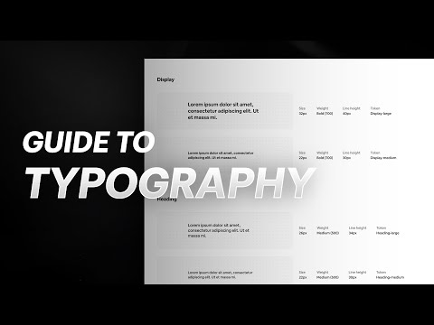
Typography Sizing and Scaling

When we construct a user interface, defining a coherent typography scale is crucial to maintain readable and accessible text across different devices. Our font sizes must adapt to both the vast landscape of the web and the compact screens of mobile apps to provide a seamless user experience.
Establishing a Type Scale
A type scale is a progression of font sizes that harmonize with each other. To establish a type scale, we first select a base font size for the body text. We then use a mathematical ratio to determine the sizes for headings and other UI elements. Common ratios include:
- 1.125 – Minor Third
- 1.200 – Major Second
- 1.250 – Perfect Fourth
For example, if our base font size is 16px, and we’re using the Perfect Fourth ratio, our H1 might be 16px * 1.250 * 1.250 * 1.250 which totals 31px.
Responsive Typography for Web and Mobile
Responsive typography ensures that our text remains legible and appealing at any screen size. To achieve this, we implement media queries in our CSS, allowing font sizes to scale up or down depending on the device’s screen width.
- Web: Larger screens benefit from greater font sizes to fill the space and maintain legibility. Conversely, we decrease sizes for smaller screens to prevent overcrowding.
- Mobile Apps: The touch interface nature of mobile devices requires larger touch targets, so we often use a larger base font size compared to desktop.
Here’s a simple CSS example for responsive typography:
body {
  font-size: 16px; /* default font size for mobile */
}
@media (min-width: 768px) {
  body {
    font-size: 18px; /* scale up font size for tablets */
  }
}
@media (min-width: 1024px) {
  body {
    font-size: 20px; /* scale up font size for desktops */
  }
}
By carefully implementing a responsive typography system in our design systems, we ensure that our content is accessible and readable for all users, no matter their device.
Incorporating Text in UI Components
In designing user interfaces, we ensure that text elements within UI components like buttons, forms, messages, and modals are legible and functionally clear to enhance user interaction and accessibility.
Buttons and Alerts
Buttons are fundamental UI elements, and we typically use succinct, actionable text like “Save,” “Submit,” or “Cancel.” Text should be center-aligned and easy to read, conveying the button’s action without ambiguity. Alerts, on the other hand, require bold and immediate language, often beginning with strong verbs like “Warning” or “Alert” to capture attention and provide clear, concise information.
Forms and Tables
For Forms, we use text to label inputs such as “Name,” “Email Address,” or “Password,” aligning the labels close to their respective input fields for clear association. It’s crucial to provide instructions in plain language to guide users through form completion. Tables, conversely, need headers with clearly labeled categories like “Item Description” or “Price” to assist users in scanning and interpreting data efficiently.
Messages and Modals
Text in Modals should be direct and informative, outlining the purpose of the modal with a clear call to action when necessary, such as “Confirm Purchase” or “View Details.” When presenting Messages, the text needs to communicate information or feedback, for instance, a success message might be “Your download has started,” using a tone that reflects the nature and urgency of the message.
UI Kit Resources and Best Practices
When diving into a UI project, it’s crucial to start off with the right resources; our choice of UI kits and their application directly impacts efficiency and the overall design process.
Free and Premium UI Kits
We’ve collected various UI kits that cater to diverse needs. These kits range from free options that are perfect for quick projects or for those of us on a tight budget, to premium selections offering a wider variety of components and unique templates. Kits like the Designing and Prototyping Interfaces with Figma provide us with templates and plugins that can serve as a valuable resource.
- Free Kits: Ideal for learning and small-scale projects.
- Premium Kits: Offer advanced features, customization settings, and often come with technical support.
Efficient Use of UI Kits in Projects
To make our design process more efficient, it’s essential to properly incorporate UI kits into our projects. UI kits should act as more than just a visual aid; they need to integrate seamlessly with our project’s settings and dashboard components. For example, kits that align with material design principles, as seen in resources like Android user interface design: Implementing material design for developers, can greatly streamline the development process.
- Select Kits that Align: Choose UI kits that match the technology and style of your project.
- Customization: Modify the kit to fit the project’s unique requirements without losing efficiency.
Accessibility and Inclusive Design
We strive to create typography UI kits that are both accessible and inclusive, ensuring every member of our audience, regardless of their abilities, can achieve optimal legibility and readability. Our commitment to clear alignment of text and the use of legible fonts promotes uncompromised user experiences for all.
Designing for a Broad Audience
We acknowledge the diversity of our audience and are mindful that our designs must cater to users with a variety of needs and preferences. Here are actionable steps we take:
- Font Selection: We choose fonts that support a wide range of characters, enabling support for multiple languages and cultural nuances.
- Color Contrast: Adequate contrast between text and backgrounds is essential, so we ensure a minimum contrast ratio is met to benefit users with visual impairments.
Ensuring Accessible Typography
Thoughtful typography is crucial for readability:
- Font Sizes: Large enough to be read by users with low vision, while providing flexibility to change the size as needed.
- Alignment: Left-aligned text is conventionally the most legible; however, we provide options for alternate alignments to accommodate different reading preferences.
By adhering to these guidelines, our typography UI kits stand as tools of inclusion, fortifying the bridge between users and seamless digital experiences.
From Concept to Final Design
When embarking on a new UI design project, we focus on establishing an operative typography UI kit from initial concept to final deployment. This foundation is pivotal in maintaining design consistency and coherence across the website or application.
Typography in the Design Process
Understanding Project Requirements: Initially, we identify the core functional requirements of the project, pinpointing how typography can support the overall user experience (UX) and brand identity. Typography is not merely about font selection; it encompasses hierarchy, readability, and accessibility—integral components that guide us through the design process in tools like Figma.
Developing the UI Kit: Armed with an understanding of the project’s scope, we create a scalable and reusable UI kit. This kit includes a curated selection of typefaces and text styles that are versatile for variegated content types. Our kit often consists of:
- Primary and secondary typefaces: Chosen for brand representation and readability.
- Headers and body text styles: Defined for hierarchy and clarity.
- Interactive elements styles: Links, buttons, and navigation must be visually distinctive and legible.
Italicize core typefaces to signify their importance, and utilize lists to visually break down the typography UI kit components for clarity.
Implementation and Testing
Integrating with Design Prototypes: Throughout the implementation phase, we systematically incorporate the typography UI kit into our designs, ensuring consistency across all screens and states. Our team iterates on website design prototypes, actively applying and adjusting typographic elements to suit responsive layouts and various user interactions.
User Testing and Refinement: No design is complete without thorough testing. We conduct iterative rounds of user testing to gather qualitative feedback on typography’s effectiveness in context. During this critical phase, we:
- Test legibility and readability across devices.
- Monitor how typography affects user navigation and comprehension.
- Refine our UI kit to address any identified usability concerns.
The result is a well-crafted interface that resonates with our users and strengthens the overall UI design. By marrying meticulous typography considerations with our iterative design and testing methodologies, we ensure that our final designs meet our high standards and project goals.

