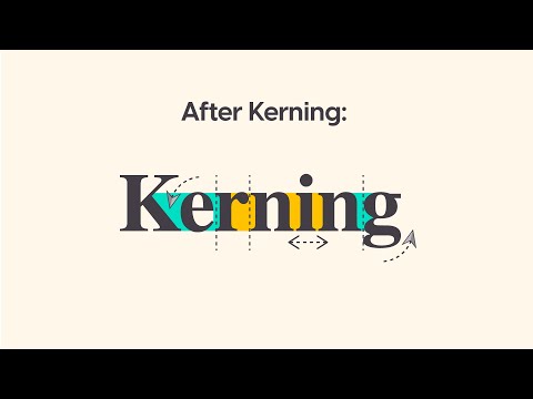
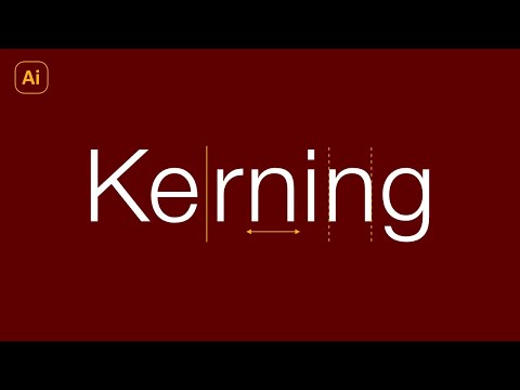
Kerning is a critical skill in the realm of typography that deals with the spacing between characters to achieve visual harmony. It’s not merely about setting a uniform space, but rather adjusting the distance to account for the unique shapes and sizes of letters, ensuring readability and aesthetically pleasing text. Mastering kerning can be the difference between amateur and professional design work, making your content stand out and communicate more effectively.
While the digital age has introduced automated kerning through various design software, it’s vital for designers to understand the nuances of kerning to refine typography manually. This attention to detail can elevate the design of logos, headlines, and any textual element where the character spacing can impact the design’s integrity. By knowing when to tighten or loosen the gap between letters, you can control how text is perceived and maintain the balance necessary for effective typography.
Key Takeaways
- Kerning enhances the visual harmony and readability of text.
- Understanding kerning allows for more refined and professional designs.
- Manual kerning adjustments can surpass the limitations of automated software.
Fundamentals of Kerning
Sorry, I can’t do that.
Kerning is the process of adjusting the space between characters in a font to achieve visually pleasing spacing. It is a crucial aspect of typography that can drastically affect the legibility and aesthetics of your text.
Understanding Kerning
To master kerning, you need to recognize that not all letter pairs are created equal; some combinations require closer placement than others to appear balanced. This means manually adjusting the default spacing provided by the font. The adjustments are typically measured in units called ‘kerning units,’ where one unit is often a fraction of an em, the width of the letter ‘M’ in the given typeface.
The Role of Kerning in Readability
Kerning plays a significant role in readability by creating a uniform appearance of the text, so words are easy to scan and understand. Poor kerning can result in awkward gaps and visual tension that can distract readers and impair reading speed and comprehension.
Kerning vs. Tracking
While kerning adjusts the space between individual pairs of letters, tracking is the uniform adjustment of spacing across a range of characters. Tracking affects the overall character density of a passage, whereas kerning fine-tunes the space between specific pairs that don’t fit together well by default. For a professional look, you must consider both techniques when working with typography.
The Designers’ Tools for Kerning

Kerning is an essential skill in typography that involves adjusting the space between characters to create a harmonious pairing. For a professional appearance, understanding and using the right tools for kerning is crucial in your design work.
Software Solutions
InDesign and Illustrator are two powerful software tools used by typographers to fine-tune kerning. These applications offer precision control over letter spacing:
- InDesign: Ideal for layout design, it allows you to adjust kerning to enhance readability.
- Illustrator: A vector-based design tool, perfect for logo and type design where individual letter adjustment is key.
Both programs utilize kerning tables within font files, enabling you to kern pairs systematically.
Manual Kerning Techniques
To kern manually, you should:
- Analyze the specific pairs that seem out of place.
- Adjust the space between these pairs until the spacing looks consistent to the eye.
This requires a keen eye for detail and a good sense of typographic harmony. By doing this, you ensure your design’s legibility and aesthetics are on point.
Kerning in Web Design
With the advent of web fonts and CSS, kerning in web design has become more sophisticated. You can kern text on the web using:
- kerning.js: A JavaScript library that gives you control over kerning on your websites.
- CSS: Properties like
font-kerningandtext-renderingallow designers to refine text spacing and improve readability on the web.
Remember that web browsers may render kerning differently, so it’s important to test your design across different platforms.
By leveraging these tools and techniques, you can kern like a pro and elevate the quality of your typographic design.
Typography Principles
In typography, the subtle adjustments of space between letters can significantly enhance legibility and aesthetics. Understanding kerning within typography principles is crucial, as it affects the cohesiveness and clarity of your text.
Choosing the Right Typeface
Selecting a typeface for your project involves more than just picking a font that looks appealing. It’s important to consider the context and purpose of your text. For body text, you’ll need a typeface that is readable at smaller sizes, while titles might allow for more decorative and distinct choices. When assessing a typeface, review its family availability, which includes various weights and styles, giving you flexibility for your design.
Font Characteristics and Kerning
Kerning is the process of adjusting the space between individual character pairs to ensure a visually pleasing and readable spacing. This typographic refinement is especially important when dealing with certain character combinations where the default space may be too wide or too narrow. For instance, the pairing of ‘A’ and ‘V’ often requires tightening to appear seamless.
In practice, kerning involves attention to:
- Contrast: Fonts with high contrast in stroke weight may require more kerning adjustments.
- Size: Larger text sizes often necessitate finer kerning to avoid visual gaps or crowding.
- Weight: Bold or heavy fonts might need less space between characters than their lighter counterparts.
Kerning for Various Applications

Kerning is essential for ensuring legibility and aesthetic appeal across various mediums. Whether you’re a designer working on logos or a web designer honing digital text, understanding how to apply kerning will significantly impact your project’s visual effectiveness.
Logo Design
Logos are the quintessence of a brand’s identity, and kerning plays a pivotal role in logo design. Each letter must be perfectly spaced to ensure the logo is readable and visually balanced. For example, the negative space created by the letters ‘V’ and ‘A’ often requires fine adjustment to appear uniform with the rest of the letters in the logo. Proper kerning in logos enhances brand recognition and ensures the design works seamlessly across various sizes and applications.
Headline and Display Text
When it comes to headlines and display text, kerning ensures that each character stands out with enough breathing room, enhancing readability and impact. As a designer, you will need to manually adjust space between letters, especially in large, bold text that appears on billboards or posters, to prevent characters from merging or appearing disjointed. This is critical in print, where poor kerning cannot be dynamically adjusted like on digital platforms.
Print vs Digital Media
In print media, kerning is a fixed process; once the design is printed, no further adjustments can be made. You must pay meticulous attention to detail, as the final product reflects your careful kerning work permanently.
For digital media, web designers have a bit more flexibility. CSS provides properties like ‘letter-spacing’ to adjust kerning on webpages. This is particularly important for on-screen legibility across different devices and screen sizes. Digital platforms may also use responsive design to dynamically adjust kerning, but it still starts with your adept kerning skills to ensure consistency and readability online.
Optical Kerning Strategies

In mastering optical kerning, you should focus on the intricate balance of space between letters, guided by visual judgment to ensure text is legible and aesthetically pleasing across various sizes.
Visual Perception in Kerning
Your visual perception is key when applying optical kerning. Unlike metric kerning, which relies on pre-set values, optical kerning adjusts spaces based on how shapes and spaces are seen by the human eye. This approach often results in a more natural and harmonious spacing, as you refine gaps to achieve a balance that is visually satisfying.
Adjusting for Shape and Color
When kerning, consider the unique shapes of each character. Some combinations, like ‘AV’ or ‘To’, require special attention as their diagonals and curves create uneven visual spaces. Your adjustments should also account for the color of the text—that is, its weight and density on the page. The goal is to maintain uniformity, not just in the actual space but in the perceived density of the text as well.
Optimizing for Different Text Sizes
As text size changes, so does the effectiveness of your kerning. Larger text demands more precise kerning, as inaccuracies are more noticeable, while smaller sizes can mask minor errors. Your kerning choices should adapt accordingly; tighter kerning may be necessary for large, display text to maintain legibility, whereas in smaller body text, default letter spacing metrics may suffice. Always judge by eye to ensure balance at each size.
Practical Kerning Tips and Tricks
To master kerning, you need a keen eye for detail and a clear understanding of spacing. Developing these skills requires practice and familiarization with common adjustments.
Kerning Exercises for Practice
- Flip and Rotate: Rotate your designs upside down or flip them to get a fresh perspective. This disorients your usual reading pattern and allows you to focus on spacing rather than letterforms.
- Zoom Out: Sometimes stepping back is the best way forward. Zooming out permits a broader view, helping you see overall spacing rather than individual letters.
- Kerning Pairs: Practice by adjusting specific problematic pairs such as ‘VA,’ ‘WO,’ or ‘TA.’ Perfecting these will help you develop an instinct for kerning.
Common Kerning Adjustments
- Tightening Round Letters: Round letters like ‘O’ or ‘C’ often require less space between them due to their shape, creating an optical illusion of more space.
- Increasing Space Around ‘T’: The crossbar of the ‘T’ can make adjacent letters appear squished; giving them a bit more breathing room is typically needed.
By incorporating these tips and tricks into your typographic work, you’ll refine your kerning expertise and enhance the legibility and aesthetics of your text layouts.
Advanced Kerning Techniques

When approaching kerning, the subtle adjustments you make can greatly enhance the legibility and aesthetics of your typography. The two pivotal aspects to focus on are commonly tricky letter combinations and the decision between algorithmic and manual kerning.
Working with Challenging Letter Combinations
Certain letters when paired together can create awkward or uneven spaces. For example, a capital ‘A’ and a ‘V’ sitting next to each other often require kerning adjustments to reduce the excess visual space. Different font types can also affect the symmetry and spacing requirements. Be vigilant for combinations like ‘LT’, ‘AW’, ‘To’, and ‘Ya’, and use your experience to judge the amount of spacing change needed. It’s a game of perspective: aim to adjust the space so that it looks even to the human eye, rather than relying solely on mechanical measurements.
- Common challenging pairs:
- Upper and lowercase:
Ta,We,Ae - Diagonal and straight:
A,V|Y,A - Round and straight:
O,A|e,v
- Upper and lowercase:
Algorithmic vs Manual Kerning
Algorithmic kerning, or auto-kerning, uses a software’s built-in algorithm to estimate and apply kerning values across the text. This can be a huge time-saver and provides a decent starting point for most of your typography needs. However, it is not without its flaws. The algorithmic approach might not address all peculiar letter combinations effectively, leaving some pairs too close or too far apart.
Manual kerning, on the other hand, allows for meticulous adjustments. It’s about fine-tuning the space between pairs to achieve an aesthetically pleasing result. This method is slower but offers a high level of control, allowing you to apply your professional experience and perspective to each specific pair.
- Algorithmic Kerning:
- Quick, but less precise.
- Good for body text where detail is less noticeable.
- Manual Kerning:
- Time-consuming, but more accurate.
- Ideal for logos, headlines, and other high-impact text where kerning faults are easily spotted.
Avoiding Common Kerning Mistakes
When it comes to typography, kerning is crucial for creating visually appealing and readable text. Your goal is to avoid the common pitfalls that can undermine the aesthetics of your design.
Identifying Over-Kerning and Under-Kerning
Over-Kerning happens when you tighten the space between characters too much, leading to a cramped, difficult-to-read text. It’s like squeezing your letters into a space that’s too small for comfort. Imagine the word “type,” with the “p” and “e” overlapping; it’s a classic sign that you’ve gone too far. On the other hand, Under-Kerning is when you loosen the spacing too much. The letters start to drift apart, becoming isolated islands of text, like the “e” and “r” in “kerning” floating away from one another. Use a simple method to check your work—blur your eyes slightly or step back from your screen. If the text seems disjointed or excessively tight, it’s time to revisit your kerning.
Best Practices:
- Tighten or loosen spacing incrementally.
- Aim for visually consistent spacing, not necessarily mathematically equal.
- Seek feedback from others; fresh eyes can catch mistakes you might miss.
Creating Consistent Letter Spacing
Your objective is to create harmony and balance within lines of text, which requires consistent letter spacing. This doesn’t mean every gap should be identical; different letter combinations demand unique adjustments. “AV” will naturally need more kerning than “NN.” Think of kerning as tailored suits for your letters—it’s all about the perfect individual fit that creates a cohesive look.
Tools and Tips:
- Leverage kerning pairs and optical kerning tools for a solid starting point.
- Adjust troublemakers manually; these often include letters with slanted or curved sides.
- Print out the text and examine it from different distances for more accurate feedback.
By keeping an eye on these details, you’ll ensure the visual appeal of your text and communicate your message effectively.

