Selecting the right layout for your Web 2.0 business site is crucial to ensure that visitors have a positive user experience, which can lead to increased engagement and conversions. It involves understanding the fundamental design elements that guide the creation of a website layout and making thoughtful choices that reflect your brand’s personality and business objectives. To achieve an effective web presence, it’s important to consider the technology and strategies that will enhance the user experience and reflect your content’s purpose.
As we embark on the journey of creating a dynamic website, we consider the various layout types that cater to different business goals, whether you’re operating an e-commerce platform, an informational blog, or a social networking site. Innovative and modern design layouts can captivate visitors, but it’s essential to master the usage of space, color, and typography to create a layout that not only looks appealing but also strengthens your branding. Additionally, the importance of measuring layout effectiveness cannot be understated – adjusting and fine-tuning your website layout based on user interaction and feedback is a continuous process that can lead to substantial improvements in your site’s performance.
Key Takeaways
- A well-thought-out website layout can significantly enhance user experience and engagement.
- The layout should be tailored to fit the specific objectives and content of the site for maximum impact.
- Continuous evaluation and improvement of the layout are key to maintaining an effective online presence.
Understanding Website Layout Fundamentals
In creating a business website layout, we must consider how structure and white space shape user experience, apply visual hierarchy principles, and explore a range of layout types.
The Role of Structure and White Space
We prioritize structure to give our web design clarity and flow. To do this, we often rely on a grid layout which provides a framework for organizing content. White space, or negative space, isn’t just empty space; it’s a crucial element that helps in reducing clutter and focusing user attention on important elements.
- Grid: A network of horizontal and vertical lines providing a scaffold for content.
- White Space: Areas with no active content, aiding in content digestion and flow.
Visual Hierarchy Principles
Visual hierarchy guides us in designing layouts that navigate user focus to key areas. By manipulating size, color, and placement, we create a path for the user’s eyes to follow, ensuring they see the most important information first.
- Size and Color: Larger, brighter elements catch attention faster.
- Placement: Top-left is often seen first in left-to-right reading cultures.
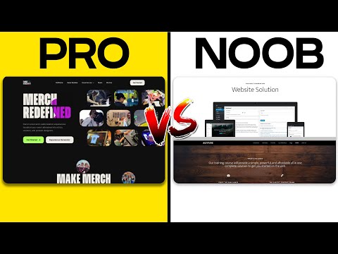
Exploring Types of Layouts
We look at various website layouts to suit different content and audience needs. A fixed sidebar suits content-heavy sites, while a single-column layout matches minimalistic designs. Understanding the purpose of our site allows us to choose the most effective layout.
- Fixed Sidebar: Keeps navigation accessible while scrolling through content.
- Single-Column Layout: Focuses the user’s attention on a linear journey through content.
Design Elements and Layout Choices

In crafting the perfect web 2.0 business website layout, we focus on elements that enhance user experience: navigation, typography, and media. These components should coalesce to form a responsive design, ensuring that our site not only looks attractive but also functions seamlessly across various devices.
Navigation Essentials
It’s crucial for our website navigation to be intuitive and consistent. Menus should be prominently placed, simplifying the task of finding information. We diverge from complex structures, opting instead for a more straightforward layout that guides visitors through our site with ease. We leverage through tools like breadcrumb trails and clearly labeled tabs to streamline navigation paths.
Typography and Readability
We carefully select fonts that embody our brand while maintaining maximum readability. Not every stylish font is legible, so we prefer sans-serif fonts for body text, saving the more elaborate scripts for headers. Our paragraphs are kept short, with ample line spacing and hierarchical formatting to invite readers into our content. Contrast is another vital factor, as we ensure that our text stands out against the background without causing strain to the eyes.
The Impact of High-Quality Images and Media
We understand that compelling visuals evoke emotions and convey information quickly. By integrating high-quality images and videos, we make our message more graspable. Every image is optimized for fast loading times and is made responsive to work on desktops and mobile devices alike. We also incorporate alternative text, aiding screen readers and bolstering SEO. Visual elements should not be an afterthought but a strategic component of our design, enhancing the overall experience without detracting from the content’s value.
Strategies for Enhanced User Experience
To effectively increase user engagement and conversion rates on a Web 2.0 business website, it’s crucial to integrate a user-centric design with well-placed calls to action (CTAs) that guide the user journey.
Effective Use of Calls to Action
CTAs are the signposts that tell our users what actions to take next. For a seamless user experience (UX), every CTA button should stand out and yet feel integral to the page design. Use contrasting colors and clear language to make them pop, but ensure they align with the overall website aesthetic. For example, a bright ‘Subscribe Now’ button on a newsletter sign-up page instantly draws the eye, prompting action.
Optimizing for User Engagement and Conversion
The ultimate goal of our website design is to convert visitors into active users or customers. We can optimize for engagement and conversion by creating an intuitive navigation structure, employing responsive design for seamless viewing on all devices, and ensuring that content is relevant and easy to interact with. By analyzing user behavior, we can continuously refine our approach. For instance, placing a ‘Free Trial’ CTA at the end of a compelling feature list can significantly increase conversion rates by offering a low-risk way to experience our services.
Tailoring the Layout for Specific Website Types
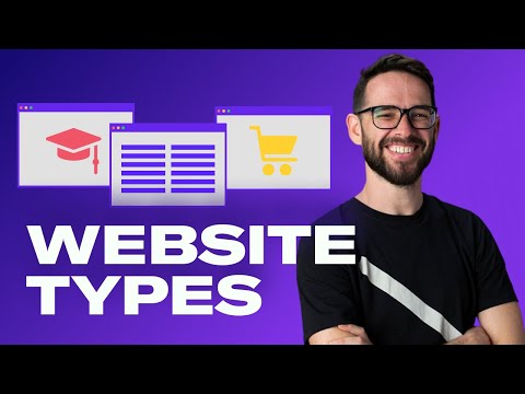
When choosing a layout for a web 2.0 business website, it’s crucial to consider the specific needs of your audience and the functionality required by your type of site. Each website type has unique traits that should be reflected in its design to optimize user experience and fulfill business goals.
Ecommerce Platforms
For ecommerce sites, our layout must facilitate a seamless shopping experience. We prioritize clear product categories and an easy-to-navigate shopping cart. Product detail pages should be laid out with high-quality images, concise descriptions, and easy access to price and purchase options.
- Home Page: Features bold promotions and best-selling products.
- Product Page: Includes high-resolution images, product variants, and “Add to Cart” button prominently displayed.
- Checkout: Simplified checkout process with clear call-to-actions (CTAs) to reduce cart abandonment.
Portfolio Sites
Portfolio websites serve a different purpose, showcasing our work in a visually appealing manner. Therefore, we opt for minimalistic layouts that make our projects the focal point.
- Gallery: Utilize a grid layout to present work and allow easy navigation.
- Case Studies: Use ample whitespace around each project, drawing attention to the imagery and the story behind each piece.
- Contact Page: Keep it accessible and uncomplicated, encouraging potential clients to reach out.
News and Magazine Sites
The layout for news sites and online magazines must accommodate a large volume of content while maintaining readability. We structure these sites with a layout that highlights breaking news, arranges articles by topic, and includes space for featured stories.
- Headlines: Display the most recent or important headlines prominently.
- Categories: Organize content in clearly defined sections for politics, sports, entertainment, etc.
- Sidebars: Use for subscription sign-ups, recent posts, or advertising space.
By tailoring the website layout to the specific needs of each business type, we ensure a better user experience that not only keeps visitors engaged but also drives them toward the desired action, be it making a purchase, viewing a portfolio, or reading an article.
Innovative Layouts for Modern Web Design
In our pursuit of creating distinguished and effective web experiences, we embrace innovative layouts that challenge traditional structure and offer fresh perspectives. Let’s explore two dynamic design approaches that can significantly impact user engagement.
Asymmetrical and Split-Screen Layouts
Asymmetrical layouts bring a dynamic and visually interesting experience to our web designs. By strategically placing elements of varying weights across the layout, we create a sense of balance without mirroring one side to the other. This approach captivates visitors by guiding their eyes through a journey of discovery. The split-screen layout further amplifies this by presenting users with a clear segmentation of content or a direct comparison between two aspects. Each panel operates independently, allowing us to showcase multiple messages without overloading users with information.
Card-Based and Modular Structures
Our designs often utilize card-based layout for its high degree of flexibility and scalability. This modular approach organizes content into digestible chunks, making it easier for users to scan and interact with individual pieces of information. These cards can serve many functions, from product displays to bite-sized content summaries, and adapt seamlessly to different screen sizes. A modular design, by extension, consists of repeating blocks that create a cohesive pattern. This results in a clean, organized site that facilitates navigation and emphasizes content in an orderly fashion.
By incorporating asymmetrical elements and split-screen techniques, along with card-based and modular structures, we craft contemporary web layouts that are both aesthetically pleasing and functionally robust.
Technological Considerations for Layouts
When selecting a website layout for a Web 2.0 business, a primary focus should be on ensuring the design adapts to various devices and leverages the capabilities of modern website builders and frameworks for an optimal user experience.
Responsive Design for Different Devices
In the era of ubiquitous internet access, responsive design is imperative. Our layout must automatically adjust to different screen sizes, ensuring it is as mobile-friendly as possible. This not only caters to users on smartphones and tablets but also accommodates desktop users with varying screen resolutions.
- Flexibility: The layout should fluidly resize content and images.
- Usability: Navigation should be intuitive on all devices.
Website Builders and Frameworks
Incorporating established website builders and frameworks can expedite development while maintaining professionalism. These tools often come with responsive design templates out of the box.
- Time-efficient: Utilize drag-and-drop editors for rapid layout construction.
- Consistency: Frameworks ensure consistent behavior across browsers.
Utilizing tailored layouts from website builders saves time without compromising on the adaptability of the design to different technologies.
Mastering Layouts for Enhanced Branding
In crafting the ideal web presence, we emphasize our brand and narrative through strategic design choices. Our website layout isn’t just a shell; it’s a powerful storytelling device that embodies our brand identity.
Conveying Brand Identity Through Design
A layout speaks before the content does; it sets the tone. We choose colors, fonts, and imagery that align with our brand to make an indelible first impression. Consider, for instance, the balance between whitespace and content—too much clutter can dilute our brand message, while a well-spaced layout accentuates it. Navigation should reflect our priorities, leading visitors intuitively through what we value most.
Storytelling with Layouts
Storytelling isn’t solely for words. We structure our pages to tell our story visually and logically. Infographics and progressive disclosure—revealing information as needed—guide the visitor like chapters in a book. By deciding which elements to highlight and which to subordinate, we create a narrative flow that walks users through our brand’s journey and values.
Measuring and Improving Layout Effectiveness
To maximize the impact of your web 2.0 business website, it’s crucial to measure and actively improve layout effectiveness. This ensures that design choices contribute positively towards engagement and conversion rates.
A/B Testing and User Feedback
A/B testing is our go-to strategy for comparing different layout designs quantitatively. By presenting two variations (A and B) to similar audience segments, we can measure which one performs better in terms of user engagement and conversions. We pair these tests with user feedback to understand the qualitative reasons behind the preferences.
Example A/B Test for Layout Effectiveness:
- Variant A: With larger call-to-action buttons.
- Variant B: With smaller buttons but more whitespace.
Metrics to measure:
- User time on page
- Click-through rates for call-to-action buttons
Analytics and Conversion Metrics
We rely on analytics tools to gather data on how visitors interact with our website. Key conversion metrics include bounce rate, session duration, and the rate at which visitors complete a desired action. By regularly reviewing this data, we’re able to pinpoint which aspects of our layout drive conversions and which areas need refinement.
Key Conversion Metrics:
- Bounce Rate: Percentage of visitors who navigate away after viewing only one page.
- Session Duration: Average time a visitor spends on the site during a session.
- Conversion Rate: Percentage of visitors who take a desired action.
By continuously assessing these elements, we can iterate on our layout designs to create the most effective and engaging user experience possible.

