Originally posted on April 28, 2024 @ 6:50 am
Choosing the right vector and flat design for your website layout is critical in creating an appealing and functional online presence. With the rise of minimalistic design aesthetics, vector graphics and flat designs have become popular due to their scalability, simplicity, and speed in loading times. They can make a website look modern and clean while emphasizing usability. As we explore examples and best practices, we’ll see that these design choices can impact not only the visual appeal but also the user experience and accessibility of a site.
When selecting a vector-based layout, consider the nature of your content and the goals of your website. Vector graphics are resolution-independent, ensuring your visuals remain crisp on all devices—a paramount factor in today’s multi-platform digital world. Meanwhile, implementing a flat design requires an understanding of color theory, typography, and layout to create a balanced, intuitive interface. Through case studies and current trends, we discover what makes these designs effective and how to leverage them for both aesthetic appeal and practical functionality.
Key Takeaways
- Vector and flat designs enhance visual appeal and user experience when used appropriately.
- Effective web design balances aesthetics with functionality, considering user navigation and content structure.
- Staying informed on current design trends ensures that your website remains modern and relevant.
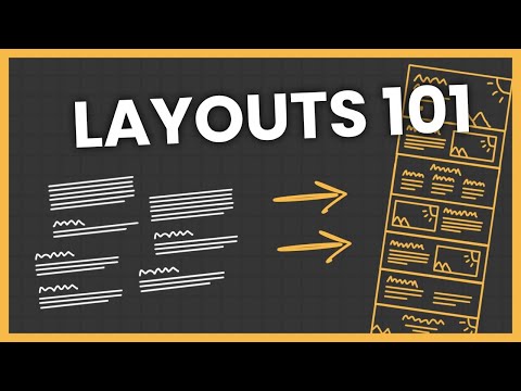
Understanding Website Layouts
When we design a website, choosing the right layout is critical. It sets the tone, guides users’ eyes, and impacts user experience profoundly. Let’s delve into the specifics of flat and vector layouts and their importance in modern web design.
Comparing Flat and Vector Layouts
Flat Design: We use flat design for its simplicity and readability. It’s characterized by:
- Minimalist approach: Lack of 3D elements, textures, and shadows.
- Bold colors and typography: Stand out against the sparse backdrop for readability.
- Focus on usability: Clutter-free spaces make for a user-friendly interface.
Vector Graphics: Employed for their scalability and quality, vector layouts excel in:
- Detail: Unlike raster images, vectors never lose quality when scaled.
- Animation friendly: Vectors are great for creating interactive elements.
- Artistic freedom: Because vectors aren’t pixel-based, we can create intricate designs that look sharp at any size.
The Role of Minimalism in Modern Web Design
Incorporating minimalism into web design serves several functions:
- Enhanced User Experience: We ensure users are not overwhelmed by sticking to only necessary elements, thereby speeding up the site load time and simplifying navigation.
- Greater Focus: With a minimal design, users’ attention is drawn to essential content without distraction.
By understanding the nuances of these layout styles, web designers are better equipped to create sites that not only look contemporary but also offer superior user interfaces.
Design Elements and Principles
Selecting the right vector and flat website layout necessitates a clear understanding of design elements and principles. These guidelines shape the visual impact of a website, ensuring that the content is not only accessible but also engaging to the audience.
Incorporating Typography and Color Schemes
The interplay of typography and color schemes lays the foundation for any website’s aesthetic. We choose fonts that complement the brand while remaining legible across devices and resolutions. Similarly, color schemes must provide sufficient contrast and align with the brand’s identity, enhancing the overall design without overwhelming viewers.
The Importance of Visual Hierarchy
Visual hierarchy is pivotal in guiding users through our site’s content. We strategically place key elements such as the call-to-action buttons and important information to draw attention efficiently. By using size, color, and space, we craft a path that the eye naturally follows, lending to an intuitive and hierarchal design.
Utilizing White Space for Clarity
White space, or negative space, is a critical yet often overlooked element. We use it to create breathing room around and between elements, which enhances readability and focus. Proper use of white space leads to a clean and clear layout, reducing cognitive load and focusing users on the content that matters most.
Integrating Grid Systems and Symmetry
We integrate grid systems to create a sense of balance and structure in our designs. This method shapes a cohesive layout, making content more navigable. Aesthetically, grids assist in achieving a symmetrical balance that’s pleasing to the eye, yet we’re careful not to let symmetry stifle creativity. It’s about striking the right balance to achieve both harmony and visual interest.
User Experience and Usability

In crafting the optimal user experience and enhancing usability, we focus on responsive design, streamlined navigation, and compelling calls to action. Let’s explore how these elements contribute to a successful vector and flat website layout.
Responsive Design for Diverse Devices
Responsive design is crucial in ensuring that all users have a consistent experience, regardless of device. With a myriad of devices in use today, from smartphones to large desktop monitors, our layout must adapt fluidly. We implement flexible grids and media queries to guarantee that content renders well on any screen size, enhancing the interactive experience for every user.
Ease of Navigation and Content Accessibility
The navigation menu is not just a component; it’s the backbone of usability. A well-structured navigation system acts as a roadmap to our content, guiding users through our site’s journey seamlessly. We prioritize clear, descriptive labels for our menu items and organize content in an intuitive hierarchy. Content should be easily accessible, with essential information being no more than a few clicks away.
Call to Action: Engaging the User
Our call to action (CTA) is the keystone of user engagement. We craft CTAs that are not only visually striking but also contextual and relevant to the user’s journey on our site. These interactive elements are designed to stand out and capture attention, prompting the user to take the next step, whether that be subscribing to a newsletter or starting a free trial. A prominent and well-integrated CTA can significantly boost our site’s interactive experience.
Trends in Web Design

In recent years, web design trends have shifted significantly, with an emphasis on clean aesthetics and user-friendly interfaces. These changes are embodied in the rising popularity of Material and Flat Design 2.0, as well as in the evolution of user interface elements that enhance user experience.
Material and Flat Design 2.0 Exploration
Material Design introduced layered interfaces, subtle animations, and depth effects that mimicked the physical world. This trend was popularized by Google and emphasized usability through intuitive design. Following this, Flat Design 2.0 emerged, maintaining the simplicity of Flat Design but adding more complexity and dimension through subtle shadows, card-style layouts, and a richer color palette. For example, iOS 7 embraced a flat UI, which transitioned away from skeuomorphism. Windows 8 also led the charge in flat design with its Metro UI, reinforcing the trend towards simplicity and color-block aesthetics.
Evolution of User Interface Elements
The evolution of user interface (UI) elements has been marked by a shift towards simplicity and efficiency. With a clear nod to flat design, UI components have become more streamlined, often employing bold simple shapes and vibrant colors. These elements are crucial in Flat UI concepts, where the focus is on minimalism and usability. As interfaces advance, the expectation is that UI elements evolve concurrently—balancing aesthetic appeal with functionality, and ensuring optimal user experiences across various devices and platforms.
Case Studies: Website Examples
In this section, we focus on the impactful use of flat design and vector graphics in modern website layouts, showcasing real-world examples that effectively utilize these elements.
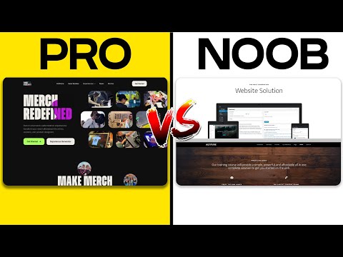
Analyzing Successful Flat Design Websites
Flat design champions simplicity and clarity through the use of bold colors and basic shapes. By examining the portfolio of Square, we observe a minimalistic approach where unnecessary design elements are stripped away, bringing content to the forefront. This design philosophy is evident in their clean lines and use of open space, enhancing the user experience with a straightforward navigational flow. The website’s layout also employs flat icons and button styles which contribute to its cohesive aesthetic, complementing their brand’s identity as modern and efficient.
Breakdown of Vector Layout Implementations
Vector graphics are scalable without losing quality, which makes them perfect for responsive web design. Take, for example, the website for Dropbox, that uses vector illustrations to narrate their story. The illustrations serve as a powerful storytelling tool, guiding visitors through the features and benefits of their service in a visually engaging manner. Such use of vector layouts not only improves visual appeal but also ensures that visuals remain crisp and clear on any device, highlighting the versatility and functionality of vectors in web design.
Creating Your Website
Before laying the first pixel, we understand the essence of choosing a template or wireframe that embodies the structure and presentation of our intended design. We focus on organizing the content in a clear and visually appealing manner, ensuring that the website speaks effectively to its audience.
Selecting the Right Template or Wireframe
When we select a template or wireframe, we seek a foundation that aligns with the overall vision for our website. A wireframe serves as the blueprint, where we lay out the structural bones of our web pages. It’s crucial that the chosen framework is flexible enough to accommodate our unique design elements while keeping the content organized.
-
Templates: Well-designed templates can be excellent time-savers, offering a variety of visual content layouts that can breathe life into our imagery and text.
-
Custom Wireframes: For more control, we might opt for creating a custom wireframe tailored to our exact needs. This ensures that every pixel is exactly where we want it, leading to an organized and intentional design.
Content Organization and Presentation
The way we present website content impacts how easily users can find the information they’re seeking. We prioritize clarity and the strategic use of imagery to communicate our message, complementing our textual content.
-
Visual Hierarchy: We organize content to guide the viewer’s eyes through the site, using bold and italic formatting to highlight key points.
-
Balance: There is a delicate balance between text and visual content, so we ensure that neither overwhelms the other to achieve a clean, flat design aesthetic suitable for a variety of devices.
By addressing these focal points, we set the stage for a website that’s not only beautiful to look at but also provides a user-friendly experience that is easy to navigate and understand.
Optimization for Search Engines and Visitors
When we design a website, our priority is to make it both searchable by Google and engaging for visitors. Achieving this requires a focus on both SEO and user experience principles to create a site that ranks well and converts visitors into customers or followers.
Improving Readability and Engagement
For optimal readability and engagement, we consider the text’s legibility and how content is presented on the page. Users should be able to easily read your content without straining their eyes or feeling overwhelmed by large blocks of text. To enhance engagement, we:
- Utilize headings and subheadings: These break up text and help visitors scan content quickly.
- Employ bullet points or numbered lists: These organize information and make details easier to digest.
- Ensure contrast between text and background: Proper contrast helps with legibility, especially for those with visual impairments.
By doing so, we foster an environment where visitors can effortlessly interact with the content, leading to longer site visits and better SEO outcomes—Google tracks engagement metrics which can influence rankings.
Strategic Use of Buttons and Interactive Elements
Efficient use of buttons and interactive elements plays a critical role in site optimization. Every button, from the Subscribe to Learn More, is a call to action (CTA) that directs our visitors to take the next step. Here’s how we make them effective for both SEO and user experience:
- Position buttons wisely: Place CTAs prominently on the page where they naturally draw the eye.
- Create compelling CTA copy: Use action-oriented, benefit-focused language to persuade visitors to click.
- Optimize for relevance and SEO: Buttons with relevant anchor text can support our site’s SEO strategy.
Interactive elements like forms and quizzes engage users more deeply, encouraging them to spend more time on our site, increasing the perceived value to Google’s algorithms. This strategic approach aims to balance the needs of our visitors with the technical criteria that Google uses to rank pages.

