Creating a clean layout for a website is essential in providing a positive user experience and communicating brand identity effectively. A well-designed website layout should not only be aesthetically pleasing but also functional, guiding visitors effortlessly through the content. The fundamentals of clean design emphasize simplicity, coherence, and focus, which all contribute to a straightforward and engaging user interface. Strategic use of whitespace, consistent typography, and a well-thought-out visual hierarchy are among the crucial elements that facilitate ease of use and highlight the most important content.
Optimizing for user experience is a crucial aspect of clean web design. This means creating interfaces that are intuitive and accessible, ensuring that the website is easy to navigate for a wide range of users. Furthermore, responsiveness to various devices plays a vital role in modern web design, requiring that layouts adapt seamlessly to different screen sizes and platforms. Integrating brand identity into the design not only strengthens brand recognition but also injects personality into the website, ensuring that it resonates with the target audience.
Key Takeaways
- Clean website design prioritizes simplicity and functionality.
- User experience is enhanced by intuitive navigation and responsive design.
- Brand identity is seamlessly integrated into the layout for a cohesive look.
Fundamentals of Clean Website Design
In crafting an effective clean website design, we focus on the proper use of white space, minimalism, and typography. These components enhance user experience by boosting readability, improving visual hierarchy, and providing an uncluttered interface.
Importance of White Space
White space, or negative space, is critical for a clean layout because it prevents visual clutter. It involves the spacing between different elements on a webpage, such as between text, buttons, or images. Properly used, white space increases content legibility and allows users to focus on key aspects of our design. For instance, ample white space around a call-to-action button can draw attention and prompt conversions.
Principles of Minimalism
Minimalism in web design is characterized by simplicity and function. We achieve this through a limited color palette and a focus on the essential elements alone. Every design component we include serves a specific purpose, without the unnecessary addition of decorative elements.
- Features of minimalist web design include:
- Sparse use of colors
- Streamlined navigation
- Reduction of visual and cognitive distractions
This approach ensures that our website is not overwhelming, thereby fostering a user-friendly environment.
Typography and Readability
Good typography is key to conveying information clearly and making the content easily scannable. We prioritize readability in our designs to ensure that text is accessible and engaging for the user. This involves selecting appropriate font sizes, line heights, and font families that are web-optimized.
- Typography best practices:
- Consistent font usage across the site for a unified look
- High contrast between text and background colors for legibility
- Adequate spacing between lines and paragraphs to facilitate reading
- Selection of sans-serif fonts for online readability
By adhering to these principles, our design elevates the overall aesthetic of the website while maintaining functionality.
Web Design Elements for a Clean Layout
In a professional website, a clean layout is crucial for user experience and aesthetics. We achieve this through careful selection of fonts, strategic use of color, and the incorporation of high-quality images.
Choosing the Right Fonts
When it comes to design, fonts play a pivotal role in ensuring readability and establishing the tone of our web content. For a clean design, we opt for bold typography that is easy to read and aesthetically pleasing. Sans-serif fonts like Helvetica or Arial are often favorites due to their crisp appearance. It is important to maintain consistent imagery throughout by limiting the number of different fonts used.
Effective Use of Color
Colors influence the mood and perception of our website. We use a color scheme that enhances the design without overpowering the content. This typically means selecting one or two primary colors and using shades of these colors alongside neutral tones to create a balanced and harmonious look. We also consider color theory principles to ensure the colors we choose work well together and appeal to our target audience.
Incorporating High-Quality Images
High-quality images are essential for a clean and professional website. They have the power to convey our brand message and engage visitors. We use consistent, clear, and relevant imagery to complement the site content, and ensure images are optimized for fast loading times. Scaling images properly and positioning them strategically within the layout helps keep our design looking sleek and uncluttered.
User Experience Optimization

In optimizing the user experience for a website, we focus on two critical elements: ease of navigation and the clarity of user interactions. By enhancing these, we ensure that our visitors find what they need with minimal effort and enjoy a seamless and positive experience on our site.
Improving Site Navigation
We firmly believe in the importance of intuitive navigation. To this end, we’ve implemented a sticky menu that remains accessible as users scroll, ensuring that crucial links are always within reach. Our menu items are clearly labeled, leading visitors through the site with logical groupings that reflect common user tasks and needs. The goal is to let visitors navigate our content with ease, allowing them to find the necessary information quickly and without confusion, enhancing the overall functionality and user experience.
Navigational components such as breadcrumbs and drop-down menus further contribute to a smooth journey across the site. We regularly review site analytics to refine menu structures based on user behavior, validating that our approach meets the demand for straightforward navigation.
Creating Intuitive Interactions
Our commitment to creating intuitive interactions involves designing elements that are easy to comprehend and use. Every interactive component, from forms to call-to-action buttons, is crafted with clarity and accessibility in mind. We cater to a diverse audience by adhering to widely recognized accessibility standards, ensuring all users can engage with our site effectively.
Interactions are not only about visual appeal but also about providing feedback to users for their actions. When a visitor interacts with our site, subtle animations or changes in element states (like color or size) affirm their action, making the experience more tangible and reassuring. This thoughtful approach to design guarantees that functionality always serves the greater purpose of an optimized user experience.
The Role of Visual Hierarchy in Layouts

In crafting a clean website layout design, the strategic implementation of visual hierarchy guides users’ eyes through the content effectively, ensuring that the most important elements take precedence.
Strategic Placement of Content
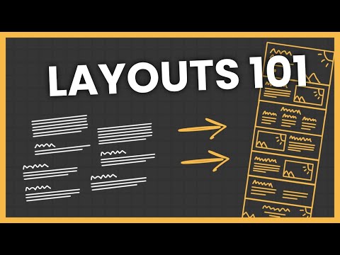
Our understanding of design principles allows us to strategically place content within a grid framework to create a solid web page layout structure. This method ensures users can navigate our content with ease. By organizing information into clearly defined areas, often utilizing column layouts, we enable a more engaging experience where users can focus on the content that matters most.
- Priority: We place essential information in high-visibility areas, such as the top-left corner, which typically attracts attention first in left-to-right reading cultures.
- Logical Flow: Information is arranged to follow a natural reading pattern, leading users from one element to the next in a seamless journey across the page.
Hierarchy Through Size and Contrast
We leverage size and contrast to establish a visual hierarchy that differentiates elements of design based on their importance.
-
Size: Larger elements are immediately noticeable and are used to draw attention to key areas of our website, such as headlines and call-to-action buttons.
-
Contrast: Contrasting colors and fonts help highlight important information and create focal points within the layout. High contrast between background and text improves readability, while subtle contrasts help to differentiate between less critical content.
-
Examples:
- Headlines: We use bold and larger text for headlines to establish them as primary focal points.
- CTAs: Our call-to-action buttons feature contrasting colors and significant sizing to stand out from other content.
By applying these principles of visual hierarchy, we create a user-friendly interface that both engages and informs our audience effectively.
Branding and Identity Integration
Incorporating a brand’s identity into website design is crucial for establishing brand recognition and customer trust. We focus on the seamless integration of logos and brand elements, ensuring consistency across all pages.
Logo and Brand Elements
Logo Integration: The cornerstone of branding on any website is the display of the logo. It’s vital that our design features the logo prominently, yet unobtrusively. We aim for the upper left corner of the website, since that’s where eyes tend to land first. The logo’s size and placement need to maintain balance with the rest of the page elements without overwhelming them.
- Aesthetic Harmony: All brand elements introduced on a website must be in harmony with one another to create a visually cohesive experience. This includes fonts, color scheme, and imagery, which should all reflect the brand’s personality and messaging. By doing this, we enhance the brand’s signature aesthetics and fortify brand recognition.
Consistency Across Pages
Page-to-Page Cohesion: We ensure that every page on the website reflects the brand’s core identity. Headers, footers, and sidebars serve as anchors for consistent branding, carrying the logo and other brand elements across different views and content types.
- Design Consistency: Uniformity in design elements like color palettes, typography, and layout structures solidifies the brand’s presence on every webpage. Consistency lets users know they are still within the brand’s domain, no matter which page they navigate to, fostering a sense of reliability and professionalism.
Engagement Features in Website Design
In today’s digital landscape, we know that a clean website layout is not just about looks; it’s about fostering engagement. To ensure that our visitors not only stay longer but also interact with the content, we implement specific design elements carefully.
Effective Calls to Action
A strategic call to action (CTA) is essential in guiding users towards desired behaviors, like making a purchase or signing up for a newsletter. We ensure that our CTA buttons stand out on the page, using contrasting colors, persuasive text, and a size that’s easily noticeable without overwhelming the overall website layout. Placement is also critical; we position CTAs where they naturally draw the eye, such as below headers or at the end of sections, so they flow with the user’s journey on the site.
- Location: Beneath headers, ending of sections
- Color: Contrasting
- Size: Noticeable, but balanced
- Text: Action-oriented, persuasive
- Position CTAs where users will naturally encounter them during their exploration of the site content.
Interactive Elements like Animations
Incorporating animations can significantly enhance user engagement. We use subtle animations to draw attention to specific elements, such as the CTA button, without distracting from the main content. Our animations smoothly guide the user’s eye, encouraging interaction and sharing of the content. By doing so, we strike a balance: our animations are inviting, not invasive, adding to the clean aesthetic and intuitive navigation of our website layout.
- Animations for CTAs: Draw attention, emphasize interaction
- Balance: Non-distracting, complementary to content
- Use animations to highlight important actions and make the overall experience more dynamic and enjoyable.
Responsive Design for Various Media
Responsive web design ensures that visitors have a seamless viewing experience across various devices. Our main focus is to optimize the layout for both mobile and desktop environments, integrating grid systems to enhance flexibility and maintain a clean aesthetic.
Mobile and Desktop Adaptation
When we adapt designs for mobile and desktop, we prioritize adaptability. For mobile devices, a full-screen hero section typically transitions to a more compact configuration to accommodate smaller screens. It’s vital that all mediums, whether a high-res desktop display or a smartphone, display content that is easily navigable and aesthetically pleasing.
Grid Systems and Flexibility
Our grid layout adopts a dynamic and flexible approach. By utilizing modular squarespace sections, our design remains clean and organized. This flexibility allows us to seamlessly integrate different content types, from text to images, ensuring that each element aligns perfectly on any screen. Grid systems also provide the structural foundation that enables our responsive web design to adapt gracefully.
In crafting our layout, we’re meticulous in maintaining consistency. Whether we present our design on a titanium bicycle manufacturer’s website or a digital magazine, our commitment to responsive principles remains the same. We ensure that the entire layout functions holistically, offering an intuitive and engaging user experience.
Showcasing Website Design Examples
When we explore the realm of clean website layouts, two focal points emerge as especially pertinent: real-world applications in various industries and the adaptive methods that set a high standard for website design.
Case Studies of Clean Layouts
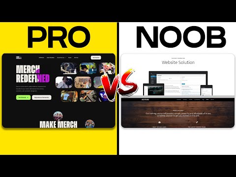
Through the lens of case studies, we can see the compelling impact of clean website design. An examination of websites like Medium demonstrates how a minimalistic approach aids in user retention and readability. Their use of white space and curated content reflects modern design principles that prioritize user experience. Similarly, examining the Apple website reveals the efficiency of using high-quality images and succinct text to convey product sophistication and innovation—hallmarks of a favorit in digital design.
Industry-Specific Best Practices
In different sectors, best practices for clean layouts manifest uniquely. An exquisite magazine-style layout, for example, relies heavily on well-organized grids and typographic hierarchy to guide readers smoothly through articles. For e-commerce, clean design translates to uncluttered product pages with straightforward navigation, allowing website templates to shine without overshadowing the products they’re meant to showcase. In the tech industry, a pristine wireframe precedes the final website, ensuring that every element serves a purpose without unnecessary distraction.

