Selecting the ideal font for a law firm’s logo is more than just a design decision; it’s a strategic move that can significantly influence the brand’s perception. We recognize that typography serves as a silent ambassador of brand identity, where the right typeface can convey trust, professionalism, and reliability — all key qualities for a legal practice. The font should be not only legible and easy to read but also convey the values and character of the firm, setting the tone for all interactions on the firm’s website and marketing materials.
We understand the role of a well-chosen font in creating a strong visual identity for a law firm. Strategic font selection helps differentiate a practice from its competitors, ensuring the logo makes a compelling and memorable statement. It’s about finding that perfect balance between aesthetics and functionality, where the typography aligns with the law firm’s message and target audience. Through careful consideration, a law firm can select a typeface that is not just visually appealing but one that resonates with potential clients and reinforces the firm’s reputation.
Key Takeaways
- The right font for a law firm logo reinforces the firm’s professionalism and values.
- Typography affects brand identity and should align with the firm’s target clientele.
- Strategic font choices in logos contribute to a law firm’s overall marketing effectiveness.
Understanding the Role of Typography in Branding

In branding, typography is not just a means of displaying words but a crucial tool for establishing brand identity and fostering brand recognition. We must carefully consider font selection and color psychology to ensure that a brand communicates the right message and instills trust.
Impact of Font Selection on Brand Identity
Selecting the right font for a law firm logo is paramount to expressing the firm’s unique identity and values. A serif font, often associated with trustworthiness and tradition, may convey a sense of reliability and respectability. On the contrary, a sans-serif font can impart a modern and clean look, signaling efficiency and a forward-thinking approach.
The style of a font influences how clients perceive a law firm. It is the subtle nuances—the weight, kerning, and letter shapes—in a typeface that make a brand distinctive and instantly recognizable.
The Psychology of Color in Law Firm Logos
The color palette chosen for a law firm’s branding can deeply affect client perceptions. Colors are not just aesthetic choices; they carry psychological implications that can align with the values and image a firm wishes to project.
- Blue is often associated with professionalism, trust, and competence, making it a popular choice in legal branding.
- Red can signify passion and strength but may also evoke aggression, which needs careful consideration.
- Green symbolizes growth and a sense of calm, potentially aligning with firms emphasizing environmental law or aiming to highlight their commitment to growth and renewal.
Integrating the right colors with the appropriate font helps solidify a coherent brand identity, enabling clients to trust and remember the firm.
Font Characteristics and Legibility

When designing a law firm logo, our focus is on ensuring that the font is legible and conveys a sense of professionalism. Legibility and readability are central to this, influenced by the choice between serif and sans-serif fonts, and optimized by the appropriate font size, letter spacing, and line spacing.
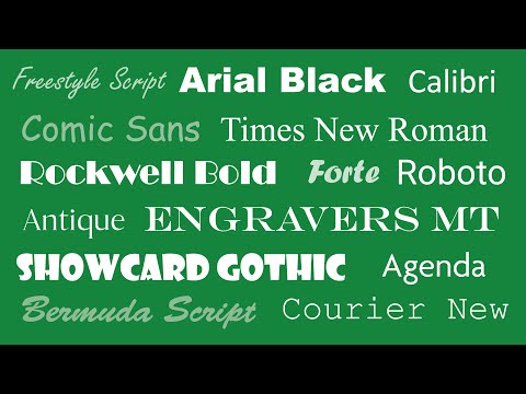
Serif vs. Sans Serif Fonts
Serif fonts, characterized by small lines or decorative strokes that finish off the ends of a letter’s main strokes, are traditionally used in print and considered to be classic and trustworthy. For a law firm’s logo, using a serif font such as Times New Roman or Garamond can suggest formality and establishment.
On the other hand, sans-serif fonts such as Helvetica or Arial offer a cleaner and more modern aesthetic. They are often easier to read on digital screens and can be perceived as approachable and efficient. Our decision between serif and sans serif will rest on the firm’s brand identity and the message we want to convey.
Optimizing Size and Spacing for Readability
The font size, letter spacing, and line spacing are crucial for readability. Fonts that are too small can be difficult to read, while those that are too large may seem aggressive or overpowering. We balance the size to ensure the logo is readable across various mediums.
Letter spacing, also known as tracking, can greatly affect a logo’s legibility. Too tight spacing can cause letters to merge visually, whereas too loose spacing can make the text appear disconnected. Likewise, line spacing, or leading, needs to be adjusted so that multi-line logos are clear and simple to decipher. Through careful adjustments, we enhance the logo’s legibility while maintaining a sophisticated appearance.
Strategic Font Selection for Law Firms
When considering font selection for law firm logos, the key factors we address are the appropriateness of different fonts and consistency across various mediums.
Evaluating the Appropriateness of Different Fonts
Font Characteristics:
- Professionalism: We prioritize fonts that exude professionalism, which includes classic serifs like Times New Roman and Garamond.
- Readability: Serif fonts like Georgia also increase readability, which is pivotal for any legal document.
- Modern Look: Sans-serif fonts such as Helvetica and Arial offer a cleaner, more modern look.
Font Use Cases:
- Law Firm Logos: Times New Roman and Garamond convey tradition and stability.
- Business Cards and Print Materials: Arial and Helvetica ensure legibility, even at small sizes.
Ensuring Consistency Across Various Mediums
Consistency Principles:
- Unified Branding: We use the same font across all platforms, from law firm logos to email signatures, ensuring a cohesive brand identity.
- Medium Adjustments: For print and web, slight adjustments may be necessary. For instance, Arial performs well on-screen, while Garamond is preferred for printed material.
Implementation Strategies:
- Marketing Materials: Maintain a consistent use of your chosen font in marketing materials for brand recognition and professional presentation.
- Digital Presence: Consistency across email and online platforms solidifies the firm’s brand identity and conveys professionalism.
Throughout, we tailor our approach to ensure that every font selected aligns with our client’s brand identity and business goals, guaranteeing that their firm is perceived with the respect and professionalism it deserves.
Integrating Logos and Font into Law Firm Marketing

When crafting a law firm’s brand identity, the strategic integration of logos and fonts plays a pivotal role in both online and offline marketing efforts. These visual assets serve as the firm’s signature across various platforms, creating a cohesive and recognizable presence.
The Role of Logos in Enhancing Brand Value
A law firm’s logo is more than just a visual mark; it’s a distilled representation of the firm’s ethos and the promise it makes to its target audience. It should convey trust, professionalism, and expertise. For example, incorporating legal symbols and icons such as the scales of justice can immediately communicate the firm’s legal specialization. The icon should also be adaptable for SEO purposes, enhancing the firm’s visibility on search engines when incorporated thoughtfully into the firm website.
- Consistency Across Mediums: Whether appearing on business cards or the website header, the logo must maintain integrity to reinforce brand value.
- Symbolic Resonance: Choosing symbols that resonate, such as pillars or the gavel, can forge a stronger connection with the target audience.
Design Elements for Online and Offline Brand Presence
The integration of logos and font must create a harmonious balance in both online and offline mediums. For web design, the layout must be user-friendly while reflecting the firm’s professional image:
- Website Layout: Ensures the logo and brand message are prominently featured, facilitating brand recall.
- Font Choice: Select fonts that are readable across devices and evoke the firm’s character.
For offline advertising, the materials should reflect the online branding to bolster the firm’s identity. The choice of font here is critical as it should not only complement the logo but also be legible in different formats from print ads to billboards. Uniformity in design elements solidifies the brand’s identity, making the logo and font an indelible part of the firm’s narrative.
By adhering to these design principles, we establish a solid foundation for our law firm’s brand identity, ensuring that it stands out in a competitive market.

