Selecting the right technical hosting and website layout is essential for creating an engaging online presence. It’s about more than just aesthetics; it’s a blend of form and function. Our website is our digital storefront, and its layout is the blueprint for our visitors’ experiences. We consider factors like user experience and technical constraints to ensure our site meets our audience’s needs and our business goals.
Within the terrain of web design, it’s crucial that our website’s architecture aligns with the behavior and expectations of our target audience. A clear, intuitive layout enhances user engagement and facilitates easier navigation, driving interaction and conversion. Additionally, maintaining a balance between visual appeal and functionality maximizes the effectiveness of our site. It’s not just about having a website; it’s about having one that works for us and our visitors.
Key Takeaways
- A well-chosen layout enhances user experience and meets business goals.
- Intuitive navigation and balanced design principles are key to user engagement.
- Addressing technical considerations ensures the website’s functional performance.
Understanding Your Audience and Goals

Before diving into website layout choices, it’s crucial to know who we are designing for and why. Our platform’s success hinges on a tailored user experience that resonates with our audience and aligns with our brand’s objectives.
Identifying Your Target Audience
Our target audience is the foundation of our website design strategy. By understanding characteristics such as demographics, interests, and behavior, we craft a user journey that is engaging and relevant. We consider factors like age, location, and technological proficiency to ensure our layout is intuitive for the people who matter most to our brand.
- Demographics: We establish who our users are in terms of age, gender, occupation, and location.
- Interests: We delve into what our audience cares about, which helps in creating content that captivates and retains users.
- Behavior: Analyzing how our target audience interacts with technology enables us to design a more user-friendly interface.
Establishing Clear Business Goals
Our business goals drive every decision we make, from the website functionality to the content we provide. Clear objectives guide our design process, ensuring that every element serves a purpose and contributes to our overall vision.
- Brand Goals: Each component of our site reflects our brand’s ethos and contributes to a coherent brand image.
- User Journey: We outline the path we want users to take, from initial visit to final conversion, and create layouts that facilitate this journey.
- Conversion Targets: Knowing our conversion targets helps us to optimize the design for the actions we want users to take.
By focusing on our audience and our business goals, we ensure that our website layout is not only aesthetically pleasing but also functional and effective in achieving our long-term objectives.
Principles of Effective Web Design

In crafting a website that stands out and provides an excellent user experience, we must adhere to established design principles. Starting with a clear visual hierarchy and ensuring the site is responsive across all devices are foundational to effective web design.
Creating a Visual Hierarchy
We establish visual hierarchy in web design to guide visitors’ attention to the most important elements first. This is done by strategically using size, color, contrast, and placement on the page. For example, the main call-to-action button should be prominent, possibly with a bold color that contrasts with the rest of the site. The navigation menu typically sits at the top of the page and uses size or weight to indicate its importance, ensuring users can find their way with ease.
Implementing Responsive Design
Implementing responsive design means ensuring our website provides an optimal viewing experience across a range of devices. A responsive site adapts to the screen size, whether it’s a desktop, tablet, or smartphone. We use flexible layouts, adaptable images, and media queries in our CSS to make this happen. Ensuring readability and usability regardless of device is not just a convenience, it’s essential to keep our audience engaged and to meet our content’s objectives effectively.
Exploring Layout Types
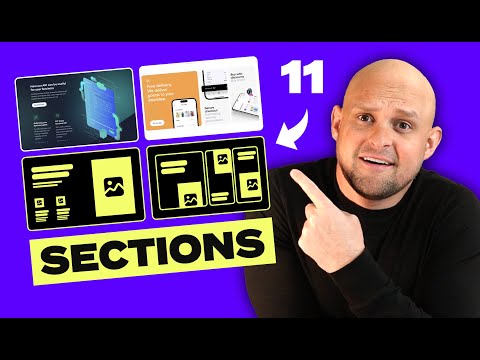
When it comes to establishing an effective web presence, selecting the appropriate layout is paramount. Our journey through website layouts will elucidate the characteristics and applications of different design structures—each with its own impact on user experience.
Single-Column Layouts
Single-column layouts offer simplicity and focus by presenting content in a linear fashion. This approach is common in blogging and portfolio websites, where a clear narrative or showcase is essential. Single-column layouts excel in mobile responsiveness as they adapt seamlessly across devices.
Grid-Based Layouts
Grid-based layouts utilize a series of intersecting horizontal and vertical lines to organize content into sections, much like a magazine layout. It’s a robust framework that supports complex arrangements while maintaining clean alignment and structure, providing an intuitive navigation experience for users.
Asymmetrical Layouts
Asymmetrical layouts break free from the conventional balance of a page, often resulting in dynamic and eye-catching designs. These layouts can lead to more engaging and creative websites by strategically placing elements to draw the user’s attention through controlled visual movement.
Split-Screen Layouts
Split-screen layouts divide the screen into two distinct areas, each with its own message or function. This dual-purpose approach can be particularly striking and useful for websites that aim to contrast two products, services, or viewpoints, offering a side-by-side comparison for visitors.
Composing the Website Layout
When embarking on the journey of designing a website, the layout serves as the foundation. It’s crucial for us to pick the right template and createa a detailed wireframe as these elements form the basis of page layout design.
Choosing the Right Template
When choosing a template for our website design, we prioritize those that align with the specific needs of our content and audience. Functionality should meld seamlessly with aesthetics, ensuring that the template enhances user experience while reflecting our brand identity. For instance, an e-commerce site requires a template that can showcase products in an organized manner, usually with options for categories and filters. On the other hand, a portfolio website benefits from a template that allows for large visual displays and a gallery feature. By picking a template that fits the purpose of our website, we set the stage for an intuitive and effectively designed website.
Working with Wireframes
Developing wireframes is a pivotal step in our process to design a website layout. A wireframe is a blueprint that represents the skeletal framework of our website pages. It’s essential for organizing our content and features with clarity before adding stylistic design elements. We focus on creating wireframes that are both functional and reflective of user experience principles. These diagrams help us visualize the arrangement of elements such as headers, footers, content areas, and navigation menus. Wireframes are usually devoid of color or detailed graphics, allowing us to concentrate on the page’s structure. We utilize wireframing tools to lay out the user interface that will ensure the most logical flow for user navigation.
Optimizing Navigation
When we talk about optimizing navigation for tech hosting websites, we’re focusing on creating a seamless user journey. The navigation menu and the icons employed play pivotal roles in guiding users effectively.
Designing the Navigation Menu
Our navigation menu must be thoughtfully structured to ensure that it aligns with the user’s needs. This entails categorizing the content logically and presenting it in a clear hierarchy. We can achieve this by grouping related items together under broader categories. To illustrate, placing ‘Hosting Plans,’ ‘Domain Services,’ and ‘Support’ under a ‘Services’ category could enhance findability. We also avoid complex dropdowns and favor a flat architecture to minimize clicks and simplify the menu.
Employing Intuitive Icons
We use icons to facilitate quick recognition. These visual elements need to be self-explanatory. For instance, a gear icon for ‘Settings’ or a shopping cart for ‘Purchases’ leverages user familiarity and improves navigation efficiency. Our icons are consistent in style and size, ensuring that each is easily identifiable and contributes to a cohesive design. It’s important that these icons complement the text labels, rather than replace them, to maintain clarity for all users.
Enhancing Visual Appeal
When we talk about visual appeal in technology hosting website layouts, we’re focusing on the strategic use of imagery, colors, and fonts that capture attention and guide the user’s eye. The goal is to create an engaging and accessible design that enhances the user experience while aligning with the brand’s identity.
Incorporating High-Quality Images
High-quality images are essential visual elements that can make or break our website’s appeal. We understand that these images set the tone for the site and influence user engagement. To achieve this, we ensure that we select images that are:
- Relevant: Directly related to the content on our site.
- High-Resolution: Crisp and clear on all devices.
For example, if we are showcasing a hosting package, we might use an image of a streamlined server that conveys reliability and performance.
Selecting Appropriate Fonts and Colors
The fonts and colors we choose play a crucial role in not only conveying our brand’s voice but also in improving readability and user experience. Here’s how we carefully select these elements:
- Fonts: We opt for web-safe, accessible fonts that are easy to read and complement our overall design.
- Colors: Our color scheme is chosen to reflect our brand, while also considering color psychology to evoke the right emotions and actions.
For instance, we might incorporate a bold font for headlines to draw attention, paired with a warm color palette that encourages users to feel welcome and secure.
By attending meticulously to these details, our website stands out with an aesthetic that is not only visually pleasing but also functionally sound.
Case Studies: Website Layouts in Action
When evaluating the impact of website layouts, it’s crucial to look at actual case studies that showcase the effectiveness of design decisions. These examples highlight strategic layouts catering to specific website goals, be it for ecommerce, portfolios, or educational content.
Ecommerce Site Features
Ecommerce websites must balance aesthetics with user experience to facilitate easy shopping. Let’s look at an example: an online store we designed implemented a grid layout that showcases their products effectively. Key features included:
- Clear Categorization: Products are divided into intuitive categories, enabling customers to find items quickly.
- High-Quality Images: Product images are high resolution and zoomable, providing detailed views that help close sales.
This layout also incorporated quick-view options and responsive design elements to ensure functionality across all devices, enhancing the shopping experience for users.
Portfolio and Personal Websites
For portfolio and personal websites, the layout we choose often focuses on presenting the work or individual in the best possible light. We designed a photographer’s website where the homepage featured a dynamic, full-screen image slider to immediately draw attention to their most compelling work. This was supported by:
- Minimalist Navigation: A clean top navigation bar that doesn’t distract from the visual content.
- Structured Galleries: Organized sections that allow for storytelling through image sequences.
By prioritizing image presentation and reducing text, we help visitors engage directly with the visual portfolio.
Educational and News Platforms
For platforms dealing with educational content and news, we must organize a large volume of information in a digestible format. One educational site we worked on applied a modular grid layout to distribute content evenly. This layout featured:
- Defined Content Blocks: Segments clearly defined by subject or theme for easy navigation.
- Multi-media Integration: Use of videos and images alongside text to cater to different learning styles.
To accommodate regular updates inherent to news websites, the design allowed for flexible content blocks that editors could easily rearrange or refresh, keeping the presentation dynamic and current. This layout choice upheld the importance of structuring content in a way that supports continuous learning and reader engagement.
Best Practices for User Engagement
In crafting an environment conducive to high user engagement, attention to detail is paramount. We ensure that every aspect of our site layout – from the optimal use of white space to strategically placed calls-to-action – is designed to keep users interested and eager to interact.
Maximizing White Space
White space, often overlooked, is a critical element in designing for engagement and usability. By effectively utilizing white space, we guide users’ attention to key content and make the user experience more relaxed and understandable. Research shows that ample white space increases comprehension by up to 20%. It’s not simply empty space, but a powerful tool to declutter our website and accentuate important information, leading to better conversion rates.
Effective Use of CTAs
Our calls-to-action (CTAs) are not just buttons; they’re the signposts that drive user action and interaction. The right CTA button should be bold and stand out, yet feel seamlessly integrated within the design. It is essential that CTAs are clear, compelling, and prompt valuable user feedback. By optimizing our CTAs, we not only encourage user involvement but also set the stage for improved conversion rates.
Technical Considerations for Layouts
When selecting a hosting website layout, we must prioritize technical aspects that impact both our site’s visibility and user experience. These include SEO optimization and loading speed, as well as accessibility and compliance with web standards.
SEO and Loading Speed
SEO: Our website’s structure must be optimized for search engines. Using semantic HTML tags enhances our site’s readability by search engines, contributing to better SEO. We ensure that headings, titles, and meta descriptions are utilized effectively for improved search rankings.
- Use of
<h1>,<h2>, etc., for headings - Optimized title tags and meta descriptions
- Proper use of schema markup
Loading Speed: A website’s loading time is crucial for both SEO and user retention. We leverage website builders and software that offer clean, efficient code output to reduce load times.
- Minimized CSS and JavaScript file sizes
- Compressed images without loss of quality
- Implementation of lazy loading for media
Accessibility and Compliance
Accessibility: Our layouts must comply with the Web Content Accessibility Guidelines (WCAG). Ensuring text can be resized, offering alt text for images, and ensuring keyboard navigation is possible are key practices for an inclusive web experience.
- Alt text for all images
- Sufficient color contrast
- Keyboard navigable links and buttons
Compliance: It is essential that our website adheres to the latest web standards and regulations. This involves regular updates and checks to ensure compatibility with different browsers and devices, maintaining consistency across our web presence.
- Regular validation of HTML and CSS
- Responsive design for all screen sizes
- Compliance with data protection laws
By focusing on these fundamental technical considerations, we ensure that our website not only ranks well but is also accessible and provides a seamless user experience.

