When selecting a website layout, it’s essential to align the design with your brand’s identity and message. Grunge vector graphics have been trending in the design community, known for their textured, vintage feel that adds character to digital spaces. Incorporating grunge elements into your website can set it apart, giving a raw and authentic edge to your online presence. However, it’s crucial to implement these design choices thoughtfully to maintain a balance between aesthetic appeal and usability.
To harness the full potential of grunge vector layouts, it is necessary to understand the design principles behind them. This involves recognizing the key elements that make up grunge aesthetics, such as distressed textures, irregular typography, and muted color palettes. Integrating these aspects with the right tools—like Adobe’s suite for vector graphics—allows you to create a distinctive yet functional layout. Moreover, ensuring your grunge website design is responsive will enhance user experience, adapting seamlessly to different devices and screen sizes.
Key Takeaways
- Grunge vector layouts add a unique and authentic touch to websites.
- A balance between grunge aesthetics and functional design is crucial.
- Responsive design is key to enhancing user experience in grunge layouts.
Understanding Grunge Aesthetics in Web Design
In web design, grunge aesthetics embody a raw and edgy feel, often embracing a handcrafted look that can set a website apart. We’ll explore its definition and historical evolution to better apply this style in modern layouts.

Defining Grunge Style
Grunge design is characterized by its rough, dirty appearance that defies the polished, clean lines standard in other aesthetics. It’s a celebration of imperfection and authenticity, often incorporating elements such as textures, torn edges, and a handmade feel. These designs can reflect an urban vibe, which resonates with a sense of rebellion against the mainstream.
- Textures: Use of paper, cloth, or wall textures that suggest wear and tear.
- Grunge style: A mix of irregular typography, asymmetrical layouts, and iconography reminiscent of urban decay.
- Torn edges: Edges that look frayed or torn, adding to the overall rawness of the design.
History of Grunge in Design
The grunge design aesthetic dates back to the early 1990s, mirroring the grunge music movement with its gritty and raw undertones. Its roots are embedded in the visual art of the music scene, with album covers and concert posters frequently featuring grunge-inspired themes. This movement was a departure from the sleek and digital feel of the 1980s, signaling a return to a more textured, handmade quality indicative of individual expression.
- Early 1990s: Emergence in tandem with grunge music, prioritizing an anti-consumerist ethos.
- Transition to digital: Incorporation of grunge elements into websites, providing a contrast to the clean-cut web designs of the era.
- Modern applications: Grunge has now been refined and can be selectively applied to web design to evoke a specific mood or brand identity.
Essential Design Elements for a Grunge Website

In crafting a grunge website, we prioritize authentic textures and bold typography, which encapsulate the essence of the style. These elements are not mere embellishments; they form the core of grunge design, setting the tone for a visceral and impactful user experience.
Textures and Vectors in Grunge Design
Grunge design is characterized by its organic, handcrafted feel. We achieve this by incorporating grunge textures such as paper stains, splatters, and distressed patterns that give depth to the layout. The utilization of vectors is equally important; we often integrate vector graphics resembling urban decay or vintage elements which align with the overall aesthetic. It’s crucial to balance these textures and vectors to avoid overwhelming the design, aiming to complement the content rather than compete with it.
- Key Textures: Paper, fabric, rust, ink splatters.
- Recommended Vectors: Stencil artwork, unkempt lines, and iconography reflective of urbanity.
Color Palette and Typography
The selection of background color and typography in grunge design is a careful curation process. We usually opt for muted, neutral, or desaturated colors that evoke a sense of the worn and the timeless, supporting our design narrative. Rich blacks and grays often serve as a foundation with occasional bursts of color to highlight key information or calls to action.
When it comes to fonts, we prefer typefaces that emulate a handmade touch. These should have the rugged edges and irregularities that mimic the grunge textures we employ elsewhere in the design.
- Ideal Color Choices: Muted earth tones, desaturated hues, deep blacks, grays.
- Font Selections: Bold and erratic fonts like stencil typefaces or imperfect hand-drawn styles that reflect raw energy.
Creating the Base Layout
When we discuss creating the base layout for a grunge-style website, it’s essential to consider both the aesthetic structure and the practical arrangement of elements such as the content area and sidebar. These core aspects define the overall user experience.
Structure of a Grunge Website
Grunge website layouts often incorporate textures and visual elements that convey a raw and rough feel. In our site layout, we aim to infuse personality without compromising on usability. The designer plays a pivotal role in balancing creative expression with the structure’s functionality. The typical structure includes a main content area where the bulk of information is presented alongside a supplementary sidebar that offers additional navigation or insights.
- Essential Components:
- Header with logo and navigation
- Main content area featuring the primary information
- Sidebar with secondary content, often links or smaller widgets
- Footer containing contact information and legal disclaimers
Textures and elements: Utilize layers of paper, fabric, and brush strokes to create a tactile depth unique to grunge designs.
Arranging Content and Sidebar
Carefully arranging the content and sidebar is crucial in our website layout. The main content area should always take precedence, as it holds the most vital information our users seek.
- Content Considerations:
- Place the most important information above the fold.
- Use typography that maintains readability amid heavy design elements.
Sidebar Placement should complement the main content without overshadowing it. Offering additional navigational links or featured information, the sidebar should be thought of as a guide that helps visitors delve deeper into our site.
- Sidebar Elements:
- A concise list of categories or topics
- Small, relevant advertisements or promos
- A search bar or social media links for further engagement
Remember, templates exist to facilitate the design process but customizing them to fit the unique grunge aesthetic and functional needs of our site will set us apart.
Incorporating Grunge Elements with Adobe Tools
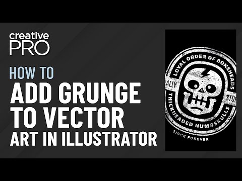
When crafting a vector grunge website layout, Adobe’s suite of tools offers comprehensive capabilities to integrate raw, textured, and edgy designs. We focus on how to utilize Adobe Photoshop and Illustrator to create these elements effectively.
Using Adobe Photoshop and Illustrator
Adobe Photoshop provides robust features to design grunge-style visuals. We leverage the Layers Panel to stack textures, making ample use of grunge brushes to add a distressed look to our graphics. Layer Blending Modes play a crucial role in achieving the grunge effect, allowing us to overlay textures organically.
In Adobe Illustrator, our approach involves the vector-based manipulation of shapes and lines to incorporate grunge elements. Utilizing the Gradient Tool, we can add depth with a tactile feel, while Illustrator’s expansive brushes library offers vector grunge brushes for that rough, street-style edge.
Applying Filters and Brushes
Photoshop excels with its Filter Gallery, where we can apply and customize filters for an edgier vibe to our layouts. Experimentation with filters such as Scratches or Film Grain adds a worn-out look that fits the grunge theme perfectly.
In both Photoshop and Illustrator (AI), brushes are instrumental. With an array of grunge brushes, we create uneven, irregular strokes that simulate the effect of aged or used materials. The key is layering these strokes using varying opacities in the Layers Panel to build complexity and authenticity in our grunge aesthetic.
By understanding and applying these Adobe tool capabilities, textures, gradients, and brushes, we craft a grunge website layout that resonates with the visceral appeal that the style is known for.
Optimizing Visual Hierarchies in Grunge Layouts
In our exploration of grunge layouts, we emphasize the importance of visual hierarchy, ensuring that the user’s eye is drawn to key elements seamlessly, without sacrificing the distinctive character of grunge design.
Balancing Content with Graphic Elements
When we balance content with graphic elements in grunge layouts, our goal is to create a harmonious presentation that enhances engagement. We carefully layer textures and patterns while maintaining the integrity of the layout. Consider a table that contrasts clean vertical lines for text with rugged horizontal textures for background elements. This contrast keeps the layout interesting but organized:
| Content Area | Texture/Pattern | Notes |
|---|---|---|
| Header | Grunge brush strokes | Draws attention, sets tone |
| Body | Subtle paper texture | Enhances readability |
| Footer | Distressed borders | Grounds the content |
Positioning for Readability and Impact
Our placement of elements on the screen greatly affects readability and impact. For maximal effectiveness, we position key content along the F-pattern layout, where the eye naturally starts scanning from the top horizontal part of the letter F, moving down to its vertical spine. This ensures a logical flow that leads users through the content. In grunge layouts, we often use asymmetrical balance to add visual interest without losing structure. Our use of dimensions and space within the grid guides users through the content without overwhelming them. For instance, a prominent headline may be offset by a smaller, yet bold, call-to-action, each positioned to maximize both visibility and aesthetic appeal.
Enhancing User Experience with Responsive Design
We understand that creating a responsive web design is essential to ensure a consistent user experience across various devices. This responsiveness is critical for grunge-style designs, which are known for their unique visual elements that must remain effective on different screen sizes.
Adapting to Various Screen Sizes
Responsive design is a crucial factor in web development that ensures our grunge website layout adapts fluidly to different devices. Our HTML and CSS are meticulously crafted to utilize flexible grids, layouts, images, and an intelligent use of media queries. Here’s what we focus on:
- Flexible Grids: We create fluid grids so that the layout components can resize in relation to one another.
- Media Queries: CSS media queries allow us to apply different styling depending on the device’s characteristics.
- Flexible Images: Our images are always set in relative units to prevent them from displaying outside their containing element.
With these responsive design practices in place, users enjoy a coherent browsing experience on desktops, tablets, and smartphones alike, maintaining the design’s integrity at every turn.
Grunge Design in the Context of Web 2.0
Grunge design contributes a textured, organic feel to the digital landscape of Web 2.0. To integrate grunge elements effectively:
- We leverage the creative freedom provided by CSS to apply textured backgrounds and rough edges.
- Applying CSS3’s capabilities for shadows and styling, we ensure that the grunge aesthetic does not compromise usability.
By striking a balance between aesthetic grunge elements and usability principles, we craft website layouts that not only embody the spirit of grunge but are also optimized for interaction and engagement within the Web 2.0 era.
Showcasing Real-World Examples
We will examine authentic instances of grunge vector designs applied in website layouts, scrutinizing specific case studies and analyzing how grunge elements function in a practical setting.
Case Studies of Grunge Websites
Example 1: Our first case study features a digital portfolio showcasing grunge-inspired artwork. This site strategically employs textures and grunge corners to embody the artist’s raw style.
Example 2: A music band’s website in our collection uses a bold grunge typeface paired with dirty textures, creating a cohesive aesthetic that mirrors their sound and brand image.
Analysis of Grunge Elements in Action
Textures and Corners: In reviewing the above cases, we notice a recurring use of textured backgrounds and distressed borders to create a sense of depth and tactile experience onscreen.
Fonts and Colors: Grunge vector elements often include irregular, bold fonts and desaturated colors. For example, a business card or brand identity featured within a website layout might exhibit these grunge characteristics to emphasize authenticity and originality.
By dissecting these elements, we gain insights into the effective integration of grunge design within various online platforms.
Maintaining Quality and Performance
When choosing a vector grunge website layout, it’s essential to balance aesthetic flexibility with technical robustness. Our focus lies in ensuring that our design not only looks good but also performs exceptionally across devices.
Ensuring Compatibility and Speed
One of our key priorities is to ensure that our vector grunge layouts are compatible across different browsers and devices. To achieve this, we employ techniques such as responsive SVG (Scalable Vector Graphics) files that adapt without losing quality. To maintain speed, we optimize our vector graphics to be lightweight, aiming for swift loading times without compromising visual fidelity.
- Responsive SVG techniques: These ensure smooth scaling on various screen sizes and resolutions.
- Optimization tools: Tools like SVGO can help compress SVG assets, contributing to faster page load times.
Quality Control for Grunge Imagery
Our grunge textures are meticulously crafted to maintain high quality while keeping performance in check. We prefer vector graphics over raster images for their scalability and smaller file sizes, which is crucial for performance.
- High-resolution vectors: Our grunge vectors are created with precision to look sharp at any size.
- Regular testing: We conduct performance tests across different platforms to ensure consistent quality and speed.
Italicized text and bold text are used to emphasize important points, making them stand out for easier scanning by the reader. Lists provide clear, concise information and are instrumental in conveying our techniques and standards in a format that is quick to digest.

