Originally posted on April 27, 2024 @ 3:09 am
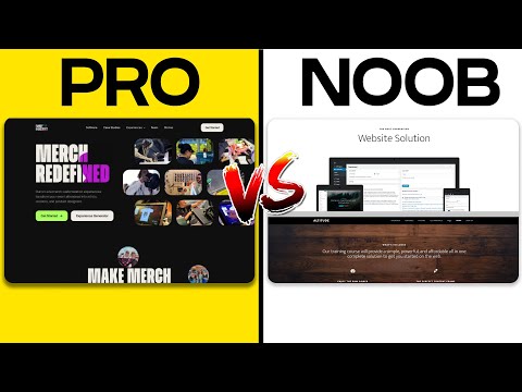
When we talk about web design, hand-drawn website layouts bring a level of personality and authenticity that can set a site apart from its competitors. Choosing the right layout involves understanding the balance between unique visual appeal and maintaining a user-friendly interface. We must blend design principles with creativity, ensuring that the resulting layout enhances the user experience and engages visitors. Integrating hand-drawn elements requires a thoughtful approach, as every doodle, sketch, and illustration plays a part in the overall narrative of the website.
We also consider technical aspects, like responsive design, to ensure our hand-drawn layouts adapt smoothly across different devices. Our choice of layout should reflect the kind of website we’re developing, whether it’s an ecommerce platform, a portfolio, or a blog. The key is to keep our audience engaged with interactive elements without sacrificing the website’s functionality. By managing this balance, we can create a hand-drawn website layout that’s not just visually attractive, but also practical and easy to navigate.
Key Takeaways
- Choosing the right hand-drawn layout means balancing unique visuals with user experience.
- Our layout must be responsive, ensuring it works well on various devices.
- The right layout engages users with interactive elements without compromising functionality.
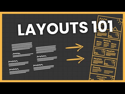
Understanding Website Layouts
Before we explore specific elements, let’s recognize that a successful hand-drawn website layout is grounded in comprehension and strategic use of grids, awareness of modern layout types, and effective navigation to guide users.
Significance of Grid Systems
Grid systems are crucial for creating structured, aligned, and cohesive web pages. A grid is composed of intersecting horizontal and vertical lines that divide a page into columns and rows. It serves as a skeleton for the layout, upon which visual elements can be organized. We use grids to maintain consistency across different pages and to establish a clear visual hierarchy, enabling users to navigate content easily.
Modern Website Layout Types
There are several layouts we often see on modern websites:
- The Z-Pattern Layout: Ideal for simple or minimalistic websites, this layout guides the eye from top-left to bottom-right, emulating the pattern people typically scan pages.
- The F-Pattern Layout: Used for websites with more text, where eyes start at the top-left, move horizontally, then drop down to the next line.
- Asymmetrical Layout: Breaks away from traditional grid patterns to create dynamic, visually interesting experiences.
Each of these types takes advantage of grids to create balanced, harmonious designs that appeal to the user while providing information effectively.
The Role of Navigation
Navigation is the GPS of our website. It allows users to understand their location within our site and how they can move to other sections. A well-thought-out navigation design facilitates a quick and easy interaction for the user, which enhances their overall experience and satisfaction with our website. The navigation should be intuitive and prominently placed, often as a horizontal bar at the top of a page or as a vertical sidebar, ensuring users can find their way without frustration.
Designing for User Experience

When designing for user experience, we focus on fostering intuitive interaction and ease of navigation for visitors. Our layouts follow proven patterns to guide user flow and promote engagement.
Developing an Intuitive Navigation Menu
An intuitive navigation menu is crucial to a positive user experience. We ensure that menus are well-organized and logically structured to allow visitors to find information quickly. Common practices include:
- Grouping similar items to reduce cognitive load
- Highlighting important or frequently used menu items
- Employing responsive design so that our navigation is accessible across all devices
The key is for visitors to move through our site with ease, finding what they need without frustration.
Applying the F-Pattern and Z-Pattern Layouts
Content layout significantly affects UX. We utilize the F-pattern for text-heavy pages as users typically read in an F-shaped pattern, scanning the full width of the top content before moving down the page and reading less horizontally. This works best for articles and blog posts.
Conversely, the Z-pattern layout suits pages with less text and more visuals. Visitors’ eyes naturally follow a Z shape, starting at the top-left corner, moving horizontally to the top-right, then diagonally to the bottom-left, and finishing at the bottom-right. This layout is ideal for landing pages and homepages where key elements like logos, menus, calls to action, and branding can be strategically placed along this path.
By applying these layouts, we enhance the user experience by aligning with natural reading patterns, which makes absorbing information more effortless and engaging.
Imagery and Visual Elements

When we design a website, the use of high-quality images and visuals is essential to creating an attractive and effective layout. Imagery is not just decoration; it’s a powerful tool to communicate with the audience and reinforce the visual hierarchy of our design.
The Impact of High-Quality Images
High-quality images catch the eye and can convey complex messages quickly. They offer a chance to showcase products or services with clarity and can leave a vivid impression. By carefully selecting imagery that aligns with our brand’s identity and message, we can create a cohesive and appealing visual narrative. Furthermore, photographs can add a personal touch, making a site feel more relatable and trustworthy.
Employing Icons and Vectors
Icons and vectors provide a universal language that helps viewers navigate our site and understand content effortlessly. They’re scalable, maintaining quality at any size, which is crucial for responsive design. Employing well-designed icons and vector images can simplify complex information and support our textual content—all without overwhelming our audience with too much text.
Incorporating Interactive Elements
In creating a hand-drawn website layout, we must effectively embed interactive elements like CTAs and multimedia to engage users. Our selection and implementation of these elements are crucial for stimulating user action and retention.
Call to Action Usage
Key Takeaways:
- Utilize high-contrast colors for CTA buttons to make them stand out.
- Place CTAs at strategic intervals and after compelling content to prompt timely user action.
We understand the importance of CTAs, as they guide users towards the actions we desire them to take. In hand-drawn website layouts, our CTAs should complement the aesthetic while maintaining visibility. Strategically placing CTAs following informative or impactful content can increase conversion rates.
Interactive Media and Videos
Key Takeaways:
- Videos must be short, engaging, and relevant to the content surrounding them.
- Interactive media elements should not impede the website’s performance or distract from crucial content.
In our experience, incorporating interactive media and videos into a website makes the content more relatable and digestible. We ensure that all videos are optimally placed to illustrate a point or to provide a visual break in the content. It’s critical to optimize these media elements for fast loading times and responsiveness across different devices.
Layouts for Different Types of Websites
As we explore the various layouts for different types of websites, it’s essential to consider the specific needs of your audience and the goals of your site. Each layout is tailored to optimize user experience and achieve the desired outcome, whether it’s to drive sales, inform readers, or present information in a clear, compelling way.
Ecommerce Website Layouts
For ecommerce websites, we prioritize ease of navigation and clarity of product presentation. Commonly, we use grid layouts to showcase products, which allows customers to quickly scan and compare items. It’s important to include clear call-to-action buttons, such as “Add to Cart” or “Buy Now,” to facilitate a smooth shopping experience. Moreover, businesses must consider mobile responsiveness, as a significant portion of online shopping occurs on mobile devices.
Landing Pages and Single-Column Layouts
Landing pages are designed with a single goal in mind, such as capturing leads or encouraging a specific action. Therefore, a single-column layout often serves best, focusing the user’s attention on the call-to-action without distractions. We keep the design simple yet visually appealing, using bold headings and bullet points to convey key benefits, making it easy for users to digest the information and make a decision.
Magazine and News Site Designs
For magazine and news sites, the layout needs to accommodate a large amount of content while allowing for easy content discovery. These sites benefit from multi-column layouts, with clear headings and featured stories. To help readers navigate, we categorize content and provide intuitive navigation menus. It’s about striking the balance between visual interest and functionality, ensuring that users can find the latest stories and in-depth articles with ease.
Responsive Design and Mobile Devices
In our digital age, it’s crucial to ensure that websites are accessible on a multitude of devices. We’ll focus on how responsive design can create a seamless user experience on various mobile devices, including those from tech giants like Apple.
Adapting to Various Screen Sizes
Responsive design is a method that enables websites to adapt to the screen sizes of devices like smartphones, tablets, and desktops. We embrace CSS media queries to restructure content fluidly, ensuring that elements resize, move, or even disappear based on the available screen real estate. For example, a complex three-column layout on a desktop might shift to a single column on a smartphone.
- CSS Techniques: Utilize flexible grids and layouts, images that resize, and an intelligent use of CSS media queries.
- Device Variety: Remember that devices come in all shapes and sizes, from small phones to large desktop monitors.
Mobile-First Approach for Modern Web
Our mobile-first approach involves designing an online experience for mobile before creating versions for larger screens. It’s a forward-thinking practice in responsive design that acknowledges the predominance of mobile devices as a primary means of web access.
- Start Small: Begin with the smallest screens and progressively enhance the design for larger screens.
- Prioritize Content: Focus on key content and functionality that mobile users need most.
By integrating responsive design principles with a mobile-first approach, we ensure that websites are not only visually appealing but also functional across all devices, offering an inclusive user experience.
Technical Aspects of Web Design
In web design, our primary goals are to ensure functionality and visibility. We focus on crafting a layout that not only looks good but also performs efficiently on various platforms, and is easily discovered by search engines.
Front-End Development Considerations
Front-end development is crucial for a seamless user experience. When we talk about front-end development, we’re referring to the part of the website that users interact with directly. This includes:
- HTML: The backbone that structures our content.
- CSS: The styling language that dictates our site’s visual presentation.
- JavaScript: Often employed for interactivity and enhancing user engagement.
We integrate these technologies to create responsive designs that adapt to different screen sizes and devices. It’s essential for us to test our designs across multiple browsers to ensure compatibility and performance. Using development frameworks and libraries can expedite this process, and choosing the right ones is a vital part of our technical strategy.
Search Engine Optimization
Search Engine Optimization (SEO) is a key factor in web design that affects the visibility and ranking of a website on search engines. Here are specific technical SEO considerations we must account for:
- Semantic HTML: Helps search engines understand the structure and content of our web pages, which is crucial for indexing.
- Responsive Design: Ensures our site is accessible and provides a good user experience on any device, which search engines like Google factor into rankings.
- Page Load Time: Fast-loading pages are preferred by users and search engines alike. Techniques such as image optimization and minification of CSS and JavaScript files help improve load time.
Integrating AI tools can significantly enhance our SEO efforts by providing insights, optimizing content, and automating repetitive tasks, enabling us to focus on more complex aspects of SEO strategy.
By paying close attention to these technical aspects, we create not just visually appealing hand-drawn layouts but also well-performing websites that stand strong in search engine rankings.
Finalizing Your Layout Design
Before we add the finishing touches to our hand-drawn website layout, it’s crucial to ensure that our design remains neat and approachable while thoroughly testing and iterating based on user feedback to optimize the user experience.
Creating a Neat and Approachable Look
Achieving a neat design means paying careful attention to the details. We’ll use grids and guides to align elements consistently, ensuring our hand-drawn elements don’t skew into a disorganized appearance. Our goal is for each visitor to find our website both visually appealing and easy to navigate. Here’s a simple checklist to maintain neatness:
- Alignments: Check that all elements align with column and row guides.
- Spacing: Ensure even and consistent spacing between elements.
- Typography: Select legible fonts and maintain hierarchy with size and weight.
We strive to make our site approachable by infusing it with a friendly and inviting atmosphere. We’ll choose warm, harmonious color palettes and include human-centric illustrations that resonate with our audience. By focusing on a design that appears accessible and easy to use, we can improve user engagement which could lead to better conversions.
Testing and Iterating the User Experience
Testing is about observing how real users interact with our layout. We’ll conduct user testing sessions to gather data on how visitors navigate our site and which illustrations attract the most attention. This direct feedback is invaluable as it helps us refine the user journey for greater efficiency and satisfaction. Key metrics to consider:
- Task Success Rate: Can users complete their desired actions?
- Engagement: Which areas do users interact with the most?
Iterating is the process of using insights from testing to make incremental improvements to our design. We’re constantly looking for ways to enhance usability and remove any barriers that prevent users from completing their goals quickly. Through a cycle of revising and retesting, we ensure the final design performs optimally and remains user-centric. Remember, iteration leads to perfection, and user experience is always evolving.

