Choosing the right vector style for your website’s layout is essential in creating a vibrant and captivating online presence. A well-designed layout not only engages visitors but also enhances the usability and an overall aesthetic of the website. It’s about striking the perfect balance between form and function—ensuring that your site is as easy to navigate as it is pleasing to the eye. By utilizing vector graphics, you can incorporate clean, scalable elements that contribute to a modern and professional look.
In the process of crafting your website layout, it is crucial to intertwine your branding and visual assets to establish a unique identity. Website layouts vary from the very simple to the exceedingly complex, but choosing the right type hinges on your intended user experience and the goals of your site. Whether you’re designing to enhance interaction, drive conversions, or ensure responsiveness across devices, each choice must be strategic and data-driven. This thoughtful approach in the initial stages of design can save time and create a more cohesive final product.
Key Takeaways
- A vector style layout should balance aesthetics with user experience.
- Branding and strategic design choices shape the layout’s effectiveness.
- The right layout is critical for interaction, responsiveness, and conversion.
Understanding Website Layout Fundamentals
Before we dive into the nuances of web design, it’s essential to grasp the fundamentals of website layout. A well-organized layout ensures that the message we wish to communicate is clear and the site is easy to navigate.
Deconstructing Grid Systems
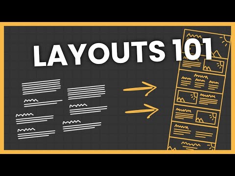
In web design, a grid system acts as the skeletal foundation upon which all design elements are placed. It’s a series of intersecting horizontal and vertical lines used to structure content. We utilize grid layouts because they create a robust framework for designing a cohesive, organized website. This not only caters to an efficient design process, but also results in a user-friendly visual hierarchy, guiding users’ eyes through the content methodically. Grids can be simple with just a few columns, or complex, accommodating a varied and dynamic layout.
Examining Design Principles
When we discuss design principles, we refer to the guidelines for creating a compelling website layout that enhances user experience. These principles include balance, contrast, alignment, repetition, and the strategic use of negative space. Paying close attention to typography is another cornerstone as it affects readability and the overall aesthetic. Each element is weighed for its visual impact and its role in the hierarchy while ensuring that the negative space is used effectively to prevent overcrowding, which can overwhelm users.
In our layouts, every component, from the largest sections down to the smallest elements, should contribute to the purpose of the site. Our objective as designers is to construct a harmonious layout that conveys the intended message with clarity and fluidity.
Strategic Layout Choices for Optimal User Experience

To enhance user experience, we carefully select layout patterns and leverage design space to guide visitor attention and cater to user behaviors. Our strategic approaches take into account established patterns and the effective use of space within the website design to minimize bounce rates and improve navigation.
Navigating the Z-Pattern and F-Pattern in Design
The Z-pattern is utilized in designs where we want to capture the natural eye movement of visitors. By placing key information and call-to-action elements along the top, middle, and bottom of the screen, we create a path that the visitors’ eyes naturally follow, ensuring that they see the most vital parts of the page. Similarly, the F-pattern is adopted for text-heavy pages, where the eye typically moves in an F-shaped pattern. This approach caters to how users read content, helping us position important information in areas that receive more attention.
Leveraging Negative Space and Visual Rest
We employ negative space, or white space, to create a breathable layout that emphasizes the most crucial elements by providing visual rest. This is not merely empty space but a strategic element that helps to reduce cognitive overload and guide visitors through content effectively. By balancing text and images with negative space, we ensure that our user interface invites visitors to stay longer, indirectly reducing the site’s bounce rate.
Adapting to User Behavior and Expectations
We tailor our user experience (UX) strategy to align with user behavior and expectations, which is essential for retaining visitors and encouraging engagement. In a split-screen layout, for example, we provide visitors with clear choices, streamlining the process of navigating to their desired content. By meticulously analyzing user behavior data, we adapt our design to improve user interaction, thus enhancing the overall UX and potentially decreasing bounce rates.
Integrating Branding and Visual Assets

When we create a website layout, integrating our brand with high-impact visual assets is crucial. It ensures that our visual hierarchy aligns with our brand identity, speaking directly to our target audience.
Utilizing High-Quality Images and Videos
We prioritize high-quality images and videos because they are instrumental in establishing an engaging brand presence online. They communicate our brand’s story and values in a compelling way that resonates with viewers. Microsoft and Apple are exemplary in utilizing visually stunning imagery that mirrors their branding. This approach maximizes the impact of each visual element, reinforcing our brand’s message with every pixel.
-
Images:
- Ensure they reflect the brand’s aesthetic and values.
- Use original, high-resolution images to convey professionalism and attention to detail.
-
Videos:
- Incorporate brand-centric themes and narratives.
- Maintain professional quality to inspire trust and confidence.
Employing Hero Sections and CTAs Effectively
The hero section is our first opportunity to captivate visitors; it’s where we make a strong visual statement about our brand. We craft our hero sections with a clear visual hierarchy to draw attention to the most important information. Next, we strategically place CTAs (calls to action) that guide users toward conversion, whether it’s signing up, making a purchase, or learning more about our products and services.
-
Hero Section:
- Use bold, thematic visuals that embody the brand and capture the target audience’s attention.
-
CTAs:
- Design CTAs that stand out yet feel cohesive with the overall design.
- Make the next step clear and straightforward for the user.
Website Layout Types and Their Uses
In crafting an effective website design, we must carefully select a layout that enhances user experience and aligns with the site’s purpose. Each layout type has distinct advantages for different content and audience needs.
Exploring Full-Screen and Split-Screen Layouts
Full-screen Layouts: These are perfect for visually-driven websites with high-impact imagery. Full-screen designs allow for powerful storytelling through large background photos, videos, or dynamic sliders. Often used by photographers, designers, and restaurant websites, they provide an immersive user experience that captures and holds the viewer’s attention.
Split-screen Layouts: Ideal for dual messaging or contrasting elements, split-screen layouts divide the screen into sections, each with its own message or content type. This layout works well when you need to equally emphasize two different areas, such as showcasing products alongside their descriptions.
Revealing the Beauty of Modular and Card Layouts
Modular Layouts: Also known as a grid or block layouts, these organize content into a clean, rigid structure, offering a straightforward path for users to navigate. Modular designs are versatile and widely used for professional portfolios, blog pages, and e-commerce sites where categorization is key.
Card Layouts: By presenting pieces of content within individual containers, or “cards,” these layouts deliver an organized and scannable user experience. Card layouts lend themselves to social media platforms, and news sites, optimizing the display of varied content types like text, images, and links.
Analyzing Single-Column and Asymmetrical Structures
Single-Column Layouts: Suited for mobile devices and sites with linear content flow, single-column layouts favor simplicity and focus. This design approach ensures readability and seamless navigation on smaller screens, commonplace in blog or text-heavy editorial sites.
Asymmetrical Layouts: These break away from conventional alignment for a more dynamic and engaging interface. Asymmetrical structures can be seen in creative industries looking to stand out, such as magazine layouts or experimental portfolios, where the balance is achieved visually rather than through uniform grids.
Designing for Interaction and Conversion
When approaching website design, we must prioritize user experience and conversion rates. Each element, from landing pages to buttons, needs to be crafted with interaction in mind to guide users toward conversion actions.
Crafting Engaging Landing Pages
Landing pages are crucial to our site’s success, acting as the frontline for user engagement and conversion. To create an impactful landing page, we ensure clear, concise messaging paired with visually appealing design. We focus on a straightforward navigation bar to lead users effortlessly towards the call to action (CTA), which is prominently displayed and encourages users to proceed to product pages or other key areas for ecommerce websites.
Creating Interactive Experiences with Navigation Menus
Our navigation menus are designed to enhance interactive experiences, making it simple and intuitive for users to browse the site. We use a logical structure with clear categories in the navigation menu, ensuring users can find information quickly, thus improving overall navigation. This straightforward approach helps maintain high engagement levels, guiding users toward our CTAs and potentially increasing conversion rates.
Optimizing Forms and Buttons for User Engagement
Forms and buttons are optimized for a frictionless user experience, featuring clear labels and highly-visible designs. We ensure all forms are concise, asking only essential information to avoid user fatigue. Our buttons feature action-oriented language, making it easy for users to take the next step, whether that’s subscribing to a newsletter or adding products to their cart on ecommerce sites. Through these optimizations, we aim to drive our site’s conversion rates significantly.
Responsive and Adaptive Design Considerations
Before we dive into the specifics, it’s important to recognize that responsive and adaptive designs are crucial to ensuring a user-friendly experience across multiple devices. Our goal is to create vibrant vector style website layouts that dynamically adjust to the viewer’s device, maintaining usability and aesthetic appeal.
Ensuring Mobile Compatibility through Responsive Design
Responsive design is an approach we utilize to ensure our website’s content looks good on all devices. This means that whether someone is viewing our website on a smartphone, tablet, or desktop, the content should seamlessly adjust to fit their screen. By using fluid grids, flexible images, and CSS media queries, we can maintain a consistent user experience. Google promotes mobile-first indexing, which makes this practice not only beneficial for users but also imperative for search engine optimization.
Adjusting Layouts for Different Screen Sizes
Adaptations in layout for different screen sizes involve more than just scaling down elements. We need to consider how layout components reshuffle to present information in the most effective manner. For instance, a three-column desktop layout might transform into a single column on mobile devices. We prioritize content based on device screen size, ensuring the most critical information is instantly accessible. Whether we’re using a platform like Wix or custom-coding, our designs should maintain their integrity and purpose without compromising on style or functionality.
Advancing Your Design Workflow
Enhancing our design workflow is pivotal to creating vibrant, effective websites. By integrating systematic wireframes and employing A/B testing, we ensure our layouts embody modern trends while maintaining clarity and usability.
The Role of Wireframes and A/B Testing
We recognize wireframes as the blueprint of our website design. Prioritizing this low-fidelity representation of our page layout design allows us to map out the structure and features of our site efficiently. Wireframes aid in pinpointing the placement of elements such as storytelling components or crucial news sections, like those seen on CNN. This early-stage presentation is key in setting a strong foundation for our vibrant vector style layout.
Implementing A/B testing is crucial in refining our design workflow. We test variations of our layout and presentations to determine which resonates best with our users. A/B testing can reveal preferences over aspects like parallax scrolling or the use of animations in our storytelling—ultimately guiding us to make data-driven design decisions.
Staying Up-to-Date with Modern Web Design Trends
In our commitment to modern web design, we keep our fingers on the pulse of modern website design trends. Embracing the latest techniques, such as dynamic and responsive page layout designs or the integration of digital design innovations, allows us to stay relevant and appealing. This constant evolution in design is what keeps our workflow advanced and our websites at the forefront of digital presentation.
Finalizing with Headers, Footers, and Accessibility
In finalizing our website design, we ensure that the header and footer not only enhance the aesthetic appeal but also serve functional purposes. We are particularly attentive to accessibility standards throughout, making the website usable for everyone.
Designing an Effective Website Header
Our header design strikes a balance between visual appeal and usability. With a featured image layout or a fixed sidebar, we create a distinct and dynamic first impression that aligns with our brand. This is where users first engage with our site, so we make navigation intuitive and ensure that important links, like to our home page and primary sections, are prominent and easy to find.
Crafting a Functional and Informative Footer
The footer is our website’s anchor, containing essential information and links that users look for, like contact details, privacy policies, and social media icons. By committing to including all relevant navigation links, we also utilize this space to reiterate our site’s structure. Our website footer isn’t just an afterthought; it’s a powerful tool for improving user experience and website usability.
Committing to Universal Design and Accessibility Standards
Accessibility is at the heart of our website designs. We follow universal design principles to ensure our website is accessible to all users, including those with disabilities. This includes accessible navigation, using proper Alt text for images, ensuring color contrast is sufficient, and more. By doing this, we make certain our website layouts are not just vibrant and visually appealing but inclusive and usable for everyone.

