Originally posted on April 21, 2024 @ 7:00 am
Screenshots, red circles, and thirty pages of recommendations like “improve mobile experience.” That’s how most web design audits end — and why most web design audits change nothing. Conversion rates stay flat. The report gathers dust in a shared drive.
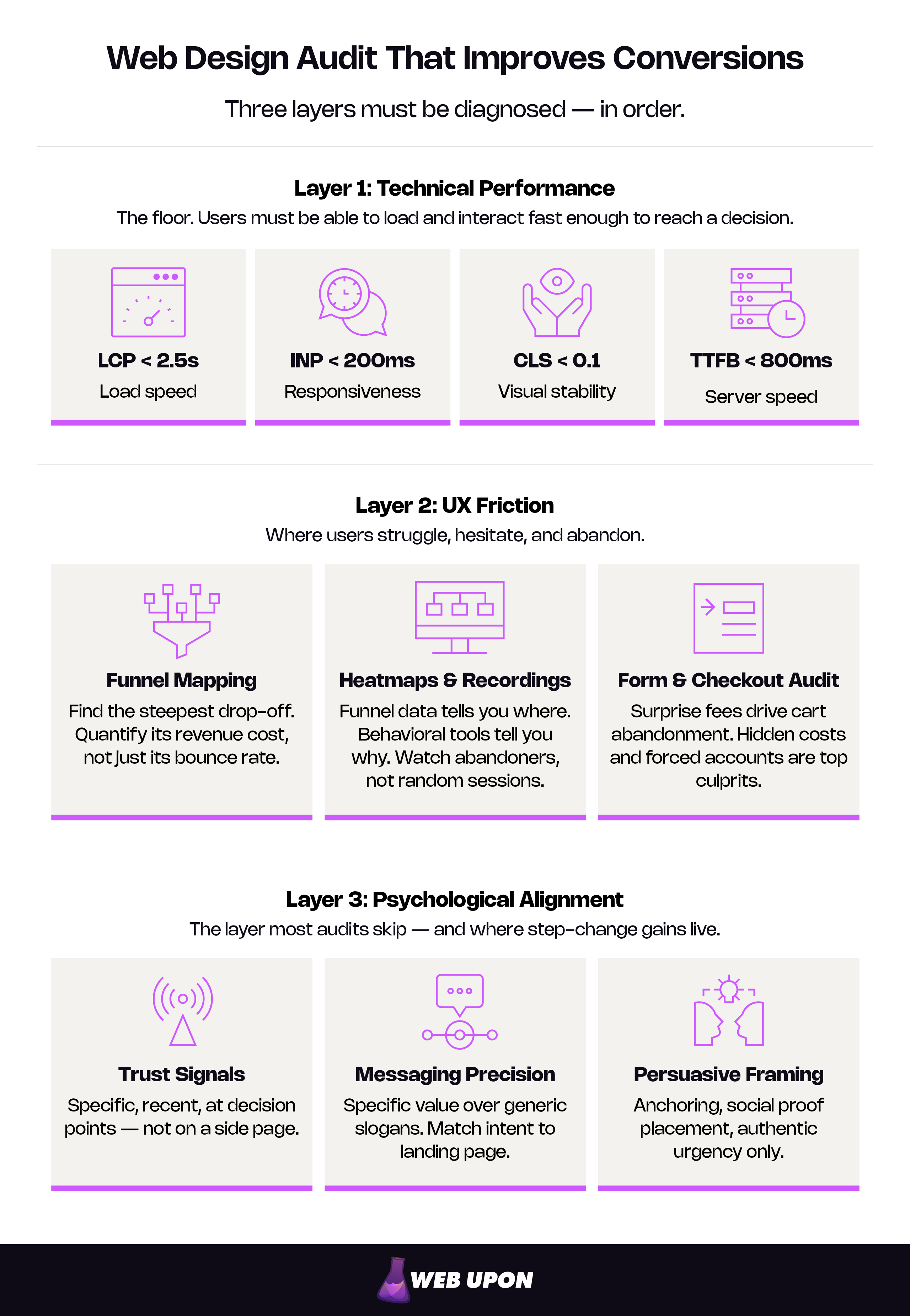
The problem is diagnostic, not decorative. A typical website design audit treats design as a visual exercise when conversion is a behavioral outcome. Moving revenue requires diagnosing three distinct layers: technical performance (can users load and interact with the site fast enough to convert?), UX friction (where do users stall, struggle, or quit — and why?), and psychological alignment (does the site’s trust architecture, messaging, and emotional framing match how users actually decide?).
This design audit framework walks each layer with specific metrics, diagnostic methods, and interpretation guidance. The output is a prioritized action plan scored by estimated revenue impact — a sequenced roadmap, not a wish list.
Built for marketing directors managing site performance at mid-market companies and e-commerce founders who need to turn “the conversion rate should be higher” into specific, fundable fixes.
Key Takeaways
- A web design audit that improves conversions diagnoses three layers — technical performance, UX friction, and psychological alignment — not just visual polish.
- Technical performance is the floor: Core Web Vitals thresholds (LCP under 2.5s, INP under 200ms, CLS under 0.1, TTFB under 800ms) gate whether users can interact fast enough to convert.
- Behavioral tools — funnel mapping, heatmaps, session recordings — reveal where and why users abandon, turning drop-offs into testable hypotheses.
- The layer most audits skip, psychological alignment (trust signals, messaging precision, persuasive framing), is where step-change conversion gains live.
- Every finding should be scored by estimated revenue impact using an Impact × Confidence × Ease framework, capped at 5–7 priority fixes per cycle.
- Audits that drive growth are recurring processes — quarterly lightweight checks, annual deep diagnostics, and ad-hoc investigations when metrics shift.
Defining Conversion Goals and Audit Scope
Before opening a single analytics report, define what “improved conversions” means for this business and this audit cycle. The most common audit failure isn’t bad analysis — it’s auditing everything, prioritizing nothing, and producing a report so broad no one acts on it.
Setting Measurable Conversion KPIs
Every web design audit needs a measurement contract: 3–5 KPIs that determine whether the audit produced results or just produced a document.
Start by separating macro conversions from micro conversions. Macro conversions are primary business outcomes — completed purchase, demo request, subscription sign-up. Micro conversions are intermediate intent signals that reveal where the funnel leaks: add-to-cart actions, email captures, pricing page visits. Tracking both matters because macro conversion rate alone hides the diagnosis. If 4% of visitors add to cart but only 1.2% complete checkout, the problem is in checkout — not product discovery.
Pull baselines from GA4 conversion reports and your e-commerce platform’s native analytics. Set improvement targets against those baselines, not industry averages from a blog post. Benchmarks vary so dramatically by vertical, price point, and traffic source that they breed false confidence or false urgency.
One metric worth anchoring to: revenue per session. It captures traffic quality and on-site experience in a single number — useful for communicating audit ROI to executives. The math: an e-commerce site converting at 2.1% with $85 AOV generates $1.79 revenue per session. A 15% lift to 2.4% moves that to $2.04. At 100,000 monthly sessions, that’s $25,000/month in incremental revenue — the kind of math that turns audit findings into approved budgets.
If your analytics setup isn’t reliably tracking these metrics, fix that first. An audit built on bad data produces bad recommendations.
Scoping the Audit: What to Include and What to Skip
An audit covering every page becomes a six-month project that never ships. Scope ruthlessly.
Pull your top pages by three dimensions: traffic volume, revenue contribution, and drop-off rate. The intersection — high-traffic pages with steep drop-offs — is where audit attention pays the highest dividends. In practice, this usually means the homepage, 3–5 top product or service pages, the pricing page, key paid landing pages, and the checkout or conversion flow. The 20% of pages driving 80% of conversion outcomes.
Define boundaries. A web design audit evaluates technical performance, user experience, and conversion design. It’s not a full technical SEO crawl (though it may surface crawlability issues) or a content audit (though messaging problems will appear). Those are adjacent workstreams the audit may trigger but shouldn’t absorb.
Estimate effort realistically. A focused audit on a 20–50 page site takes 8–12 hours. A large e-commerce catalog (500+ SKUs, multiple conversion paths) takes 15–20 hours. Compressing a complex audit into an afternoon produces surface-level findings — the kind this framework replaces.
Finish this step with a written scope document: pages to audit, KPIs to measure, time estimate. That document is the audit’s accountability contract.
With clear goals and a defined scope, the diagnostic begins — starting with the technical layer that determines whether users even get a chance to convert.
Layer 1: Technical Performance Audit
The page takes four seconds to load. The checkout button doesn’t respond on tap. None of the persuasive copy or conversion design downstream matters. The technical layer is the floor — it determines whether users can physically access and interact with the site fast enough to reach a decision.
This isn’t about chasing a perfect PageSpeed score. A website performance audit at this layer identifies the bottlenecks that measurably degrade experience and quantifies their conversion cost.
Core Web Vitals and Page Speed Assessment
Google’s Core Web Vitals measure the dimensions of page experience users actually feel. Each has direct conversion implications.
| Metric | Target | What It Measures | Conversion Impact |
| LCP (Largest Contentful Paint) | Under 2.5s | Perceived load speed — how quickly primary content becomes visible | Beyond 3 seconds, 53% of mobile users abandon. Slow LCP creates the impression the site is broken before it gets a chance to persuade. |
| INP (Interaction to Next Paint) | Under 200ms | Responsiveness — how quickly the page reacts to taps, clicks, and key presses | Replaced FID on March 12, 2024. Critical for filters, add-to-cart buttons, form submissions. Sluggish INP makes users question whether their action registered. |
| CLS (Cumulative Layout Shift) | Under 0.1 | Visual stability — whether elements shift position during loading | Layout shifts cause mis-clicks, especially on mobile. A user reaching for “Add to Cart” that jumps when a late-loading banner pushes it down doesn’t just miss — they lose trust. |
| TTFB (Time to First Byte) | Under 800ms | Server responsiveness — how quickly the server begins delivering the page | A server-side diagnostic. If TTFB exceeds the 800ms “good” threshold, no front-end optimization fully compensates. Investigate hosting, database queries, and server-side rendering first. |
Run tests through PageSpeed Insights, which pulls field data from the Chrome User Experience Report (CrUX) alongside synthetic lab data. Field data reflects real user experience across real devices and networks — and it’s what Google uses for ranking signals. Lab data diagnoses specific issues in controlled conditions but doesn’t represent production reality. When the two diverge, prioritize field data.
For a deeper technical performance audit, Web Upon’s speed optimization team runs full diagnostics beyond this framework.
Mobile Responsiveness and Cross-Device Testing
Google completed mobile-first indexing on July 5, 2024. The mobile version is now the version Google evaluates for rankings. Mobile isn’t a secondary audit lens — it’s the primary one.
Key mobile audit checks:
- Tap targets: Minimum 24×24 CSS pixels per WCAG 2.2 (Level AA), with platform guidelines like Google’s Material Design recommending 48×48dp for optimal touch usability. Adequate spacing between adjacent elements matters equally — undersized or crowded targets cause frustration and mis-taps that push users toward abandonment.
- Text readability: Legible without pinch-to-zoom. Base font below 16px or line lengths beyond ~70 characters make reading effortful.
- Viewport configuration: Viewport meta tag properly set, no horizontal content overflow forcing side-scrolling.
- Interactive element spacing: Form fields, nav links, and CTAs need enough room for a thumb to reliably hit the intended target.
Test on the devices and browsers your users actually use — pull the breakdown from GA4 and prioritize the top 3–5 combinations by session volume. “It looks fine on my iPhone” is not a mobile audit.
Conversion killers that surface on audit after audit: sticky headers consuming significant mobile screen real estate, forms lacking mobile-optimized input types (numeric keyboards for phone fields, email keyboards for email), and primary CTAs sitting below the fold on the most common mobile viewports.
Accessibility as a Conversion Factor
Accessibility isn’t a compliance checkbox separate from conversion. It’s a conversion multiplier. The same principles that make sites usable for screen readers — clear labels, logical tab order, sufficient contrast — reduce friction for every visitor.
Audit against WCAG 2.2, the current standard for 2026. Focus on the criteria with the most direct conversion impact:
- Color contrast: 4.5:1 minimum for normal text, 3:1 for large text. Low contrast reduces readability for anyone in sunlight, on a bright screen, or experiencing eye fatigue — not just users with visual impairments.
- Keyboard navigation: Every interactive element reachable and operable via keyboard. Catches issues affecting power users, motor-impaired users, and anyone with a dead trackpad.
- Form labels and error identification: Programmatically associated labels on every field. Error messages that identify the specific problem and suggest correction — not vague “please fix the errors” blocking messages.
Automated tools (axe DevTools, WAVE, Lighthouse) catch roughly 30–40% of issues. Reading order, meaningful alt text, and cognitive flow require manual testing. Budget for both.
Two compliance timelines for business planning: the European Accessibility Act took effect June 28, 2025, covering EU digital services. The DOJ’s Title II deadline is April 24, 2026, for state and local government entities. But the conversion case stands independently of legal exposure — accessible forms have lower abandonment, accessible navigation reduces friction for all users.
Where accessibility gaps overlap with technical SEO issues, a comprehensive SEO audit evaluates the full intersection.
Technical performance sets the floor. The next layer investigates what happens after users arrive: where they struggle, hesitate, and leave.
Layer 2: UX Friction and User Behavior Audit
The technical layer confirms the site works. This layer asks whether it works for the user — whether people accomplish what they came to do, and where they fail. A user experience audit shifts from infrastructure to behavioral analysis here, combining funnel data with qualitative observation to build testable hypotheses about what’s costing conversions. Where the technical layer dealt in load times and responsiveness, this UX audit deals in intent, effort, and abandonment.
Mapping and Diagnosing the Conversion Funnel
Map the paths users actually take, not the paths you designed. The gap between intended journeys and actual journeys is where the highest-priority findings live.
Build a funnel exploration in GA4: landing page → engagement page (product, pricing, feature) → conversion initiation (add to cart, start trial, begin form) → completion (purchase, sign-up, submission). The step with the steepest drop-off is your highest-leverage finding.
At each stage, ask diagnostic questions:
- Awareness: Are users finding the right pages from search and ads? Do landing pages match traffic-source intent?
- Consideration: Are users engaging with key content — product details, pricing, case studies — or bouncing after a surface scan?
- Decision: Where do users abandon the conversion flow? What’s the last element they interact with before leaving?
- Completion: What percentage of users who initiate conversion finish it? Where in the form or checkout do they stall?
Quantify the revenue cost of each drop-off. If 40% of users abandon between product page and cart on a site with 50,000 monthly product views and $3.50 session value, that drop-off carries a specific dollar figure. That number gets fixes funded. “High bounce rates” doesn’t.
When funnel analysis reveals systemic conversion issues, Web Upon’s CRO team can design and run a structured testing program.
Using Heatmaps and Session Recordings to Find Friction
Funnel data tells you where users drop off. Behavioral tools tell you why.
Heatmaps come in three types:
- Click heatmaps: Often the most revealing signal isn’t where users click successfully — it’s where they click non-interactive elements. High click density on a static image or unlinked headline signals confusion about what’s clickable.
- Scroll heatmaps: If 70% of users never pass the first screen, your CTA near the bottom is functionally invisible to most visitors.
- Move heatmaps (desktop): Cursor movement loosely correlates with visual attention. Useful for spotting which content areas draw engagement and which get skipped.
Session recordings provide qualitative depth. Don’t watch random sessions — filter for users who abandoned at your key drop-off points. Watch 20–30 and look for patterns: rage clicks (rapid repeated clicks on unresponsive elements), excessive scrolling (searching for information they can’t find), back-and-forth navigation (comparison needs that the site doesn’t serve).
Synthesize observations into testable hypotheses: “Users rage-click the shipping info link on the product page → hypothesis: shipping costs are unclear before checkout → test: add shipping estimate above the fold.” Each finding ties observation to explanation to experiment.
Auditing Forms, Checkout, and Critical Conversion Points
Forms and checkout flows are the highest-stakes interaction points. Friction here destroys the value of all the marketing spend that brought users this far.
Form audit priorities:
- Field count: Every unnecessary field costs completions. If you collect phone numbers but never call leads, that field delivers zero business value at measurable conversion cost.
- Validation: Inline validation (errors shown as each field is completed) outperforms post-submit validation in both completion rate and user satisfaction.
- Mobile form experience: Correct input types (numeric keyboard for phone, email keyboard for email), autofill attributes present, floating labels that remain visible after typing begins.
- Progress indicators: Multi-step forms without visible progress trigger abandonment — users can’t estimate remaining effort.
Checkout audit (e-commerce):
- Guest checkout: Available and prominent, or buried behind account creation? Mandatory registration before purchase is a top abandonment driver.
- Cost transparency: Surprise shipping costs and fees appearing late in checkout remain among the most cited reasons for cart abandonment. Surface totals early.
- Trust signals at payment: Security badges, accepted payment logos, return policy reminders — visible at the moment users enter payment info, when anxiety peaks.
- Payment options: Multiple methods (cards, digital wallets, buy-now-pay-later) reduce friction for users with strong preferences.
SaaS conversion point audit:
- Trial sign-up friction: How many fields stand between interest and access? Can a user start in under 60 seconds?
- Pricing page clarity: Plan differences scannable at a glance? The comparison matrix answering: What do I get? What does it cost? Which plan fits me?
- Feature comparison usability: Matrices requiring horizontal scrolling on mobile are audit failures hiding in plain sight.
Friction patterns that appear on nearly every audit:
- Mandatory account creation before purchase or trial
- Total costs hidden until the final checkout step
- Generic error messages that don’t specify the problem or how to fix it
- Placeholder text as the only field label — disappears on input, forcing memory load
- Primary CTA below the fold on mobile, requiring a scroll the user may not make
Where friction points to deeper structural design issues, e-commerce web design or SaaS web design services address root architecture rather than patching symptoms.
UX friction analysis reveals where users struggle mechanically. The final layer goes deeper — into why users hesitate, doubt, or disengage even when the experience is technically smooth.
Layer 3: Psychological and Emotional Alignment Audit
This is the layer most guides skip — and the one that separates incremental improvements from step-change conversion gains. A site can load fast, flow smoothly, and still fail to convert because it doesn’t align with how users actually decide. This layer examines trust architecture, messaging precision, and psychological framing: the factors that determine whether a visitor commits or clicks away.
A thorough conversion rate optimization audit accounts for all three layers. Skipping this one means optimizing mechanics while ignoring motivation.
Auditing Trust Signals and Credibility Cues
Trust isn’t a feeling users arrive with — it’s something the site builds element by element at each stage of the journey. Every effective trust signal answers a specific doubt: Is this company real? Will this product work? What if I need to return it? Is my payment safe?
Conduct a trust signal inventory:
- Social proof: Reviews, testimonials, client logos, case studies. Are they specific (named companies, quantified results) or generic (“Great product!”)? Recent or visibly dated? Placed at decision points — pricing pages, checkout, sign-up forms — or buried on a standalone testimonials page no one visits?
- Security and credibility: SSL indicators, checkout security badges, certifications. Do they appear at the payment step, where anxiety peaks?
- Risk reduction: Return policies, guarantees, trial terms. Visible and specific (“30-day full refund, no questions asked”) — not hidden in legal footnotes.
- Human presence: Real team photos, named contacts, physical address, phone number. Sites with no visible human presence trigger skepticism, especially for high-consideration purchases.
Audit for consistency across pages. A polished homepage leading to a dated-looking product page creates subconscious dissonance. Users won’t articulate why they lost confidence — they just leave.
Check transparency. Is pricing visible or hidden behind “contact us for a quote”? Are shipping costs and return policies accessible within one click from any product page? Hidden information doesn’t create curiosity — it creates suspicion.
Evaluating Messaging Alignment with User Motivation
Clean design, fast load, functioning forms — a site can have all three and still underperform because its messaging misses what users care about at the moment they’re reading.
- Value proposition audit: Is the primary value proposition above the fold on key pages? Is it specific and quantified (“Reduce onboarding time by 40%”) or generic (“We help businesses grow”)? Generic value propositions are functionally invisible — eyes slide past them because they carry no information.
- Message-intent match: Does each landing page deliver on the promise that brought the user? If someone clicks an ad for “affordable project management software” and lands on a page leading with enterprise features and no pricing, the mismatch shows up as a high bounce rate. The page isn’t broken — it’s answering the wrong question.
- CTA evaluation: Audit every call-to-action for specificity (“Start your free 14-day trial” vs. “Submit”), placement (at logical decision points, not only at page bottom), and singularity (one clear primary action, not three competing options). A page with three equally weighted CTAs often converts worse than a page with one.
Before/after — messaging that converts vs. messaging that decorates:
- Vague: “Our platform helps teams collaborate better.”
- Specific: “Cut meeting time by 35% with asynchronous project updates your team actually reads.”
The specific version offers a mental image, a number, and a mechanism. The vague version describes a thousand products.
Applying Persuasive Design Principles
Persuasive design applies well-documented cognitive patterns to reduce decision friction. It’s not manipulation — it’s alignment between the site experience and how human brains actually evaluate options.
- Cognitive load: Can a new visitor identify the page’s primary purpose and primary action within five seconds? If they’re simultaneously processing navigation options, product specs, a promotional banner, and competing CTAs, overload makes inaction the most likely outcome.
- Social proof placement: A testimonial on the homepage is brand-building. A testimonial next to the “Start Trial” button is conversion architecture. Audit the proximity of your strongest proof to your most important decision points.
- Loss aversion and urgency: Countdown timers, “only 3 left” indicators, limited-time offers — audit whether they’re authentic. A countdown that resets on page refresh erodes trust the moment users notice. And they notice. Authentic urgency converts. Manufactured urgency may convert once but damages brand perception and repeat behavior.
- Anchoring: How pricing tiers are structured influences perceived value. A three-tier page where the middle option appears to be the best deal (relative to a deliberately premium top tier) is anchoring. Audit whether your pricing uses this intentionally — or inadvertently makes the wrong option look most attractive.
- Intentional vs. accidental friction: Not all friction is bad. A qualification form that routes leads to the right sales team improves lead quality even as it reduces volume. The audit must distinguish friction that serves a business purpose from friction no one thought to remove.
When trust, messaging, and persuasion issues run deep, a strategic web design overhaul often delivers more ROI than patching individual elements.
With findings from all three layers, the audit’s value depends entirely on what happens next — translating observations into a prioritized plan that drives measurable improvement.
Building a Prioritized Action Plan from Audit Findings
This is where most audits die. The analysis was solid, the findings real, but the output was a 40-item list with equal weight. Nothing got prioritized, so nothing got implemented. A web design audit checklist that produces action needs a scoring framework — a way to rank findings by estimated revenue impact so the team knows what to fix this week, what to resource next quarter, and what to drop.
Prioritizing Fixes by Revenue Impact
Score every finding with the ICE framework: Impact (how much will this improve conversions?), Confidence (how certain, based on data quality?), and Ease (how much effort to implement?). Each dimension 1–10, multiplied for a composite score.
| Finding | Impact | Confidence | Ease | ICE Score | Tier |
| Add shipping estimate to product page (recordings show users searching for cost info) | 8 | 7 | 9 | 504 | Tier 1 — This week |
| Move trust badges above fold on checkout | 7 | 6 | 9 | 378 | Tier 1 — This week |
| Rebuild mobile checkout (multi-step with progress indicator) | 9 | 8 | 3 | 216 | Tier 2 — Plan and resource |
| Redesign pricing page comparison matrix | 6 | 5 | 4 | 120 | Tier 3 — Backlog |
Connect each finding to revenue: identify the funnel metric it affects, estimate conversion lift, multiply by traffic and average order or deal value. “Fix checkout trust signals” is a recommendation. “Adding trust badges at checkout could reduce cart abandonment by 5–8%, representing $12,000–$19,000 in monthly revenue at current traffic” is a business case.
Cap the active list at 5–7 priority fixes per audit cycle. Anything more splits attention and guarantees partial execution.
Structuring the Audit Report for Stakeholder Buy-In
The audit report is a persuasion document. Its job is to get fixes approved and resourced, not to catalog problems. Structure it for decision-makers who’ll skim page one and read deeply only if that page earns it.
Report structure:
- Executive summary (one page max): Top 3–5 findings with estimated monthly revenue impact. This page alone should make the case.
- Methodology: Brief explanation of the three-layer framework, scope, and tools.
- Findings by layer: Each finding with supporting evidence — annotated screenshots, heatmap overlays, session recording clips, funnel data.
- Prioritized recommendations: The ICE-scored table with tier assignments.
- Implementation roadmap: Timelines, resource needs, ownership for each Tier 1 and Tier 2 item.
Present in business language. “The pricing page has poor information hierarchy” means nothing to a CFO. “Users can’t compare plan features on mobile, correlating with a 34% pricing-page drop-off representing $X in monthly pipeline” gets budget approved.
Include visual evidence for every major finding. Annotated screenshots, heatmap overlays, before/after mockups — these collapse the distance between “here’s the problem” and “yes, fix it.”
The audit report is a starting point. Implementing changes through structured testing is where findings become revenue.
Implementing, Testing, and Sustaining Conversion Gains
An audit that stops at the report has a shelf life measured in weeks. This stage converts findings into validated improvements and establishes the audit as a recurring process.
Testing Changes Through Structured Experimentation
Don’t implement everything at once. When all changes ship simultaneously, you can’t attribute results — no way to know which fix drove the lift and which had no effect.
A/B testing is the gold standard but requires sufficient traffic — typically several hundred conversions per variation for statistical significance within a reasonable window. Lower-traffic sites should use before/after measurement with controlled observation periods instead.
Structure hypotheses directly from findings: “Changing [element] on [page] will [improve metric] by [estimate] because [audit evidence].” Example: “Moving trust badges above the fold on checkout will reduce cart abandonment by 5–8% because session recordings showed 23% of abandoning users scrolled searching for security indicators.”
Test sequentially. Highest ICE score first, measure, document learnings, then move to the next. This builds an evidence library that sharpens every future audit.
Tracking Results and Building a Continuous Audit Cycle
Track weekly during the first 4–8 weeks post-implementation, then monthly. Quick wins (form optimization, CTA repositioning, trust signal placement) may show impact in 1–2 weeks. Structural changes (navigation overhauls, checkout redesigns) need 4–8 weeks before confident evaluation.
Build the audit into a recurring cadence:
| Trigger | Audit Type | Scope |
| Quarterly | Lightweight | Top 5 conversion pages, KPI trends, new friction signals |
| Annually | Deep audit | Full three-layer framework across all priority pages |
| Major traffic drop | Ad-hoc | Investigate affected pages, check for technical regressions |
| Conversion decline | Ad-hoc | Funnel analysis on the declining metric |
| Redesign or major release | Ad-hoc | Pre-launch audit of changed pages vs. baseline |
Each cycle builds on the last. The previous backlog becomes the starting point — checking whether fixes held, whether deprioritized items have escalated, and whether new issues emerged. Over time, this compounds: each cycle refines the site, sharpens diagnostic instincts, and raises the conversion floor.
For help building this into a sustained program, Web Upon’s CRO team can run the ongoing testing and measurement.
From Audit Findings to Revenue Growth
A web design audit that moves conversions is a three-layer behavioral diagnostic — technical performance to UX friction to psychological alignment — with every finding scored by estimated revenue impact. The framework works because it mirrors how conversion problems actually layer: a site must function before it can be usable, and it must be usable before persuasion and trust take effect.
The difference between audits that collect dust and audits that drive growth is prioritization — and the discipline to test sequentially, measure outcomes, and feed learnings into the next cycle. Each round sharpens the diagnosis. Over time, the audit stops being a project and becomes the operating rhythm that steadily raises your conversion floor.
Go deeper on each layer:
- Website Speed Optimization & Audits — Technical performance diagnostics beyond this framework
- Conversion Rate Optimization — Ongoing testing programs for sites past one-time audits
- GA4 Analytics Setup & Consulting — Analytics foundation before you audit
- SEO Audit — Technical SEO evaluation complementing design audit findings
- E-Commerce Web Design — Design and build for e-commerce sites ready for post-audit overhaul
If running this audit internally feels like more than your team can take on, Web Upon’s design and CRO team runs this exact diagnostic framework for mid-market and e-commerce companies. Talk to us about your site.

