Originally posted on March 17, 2024 @ 6:40 am
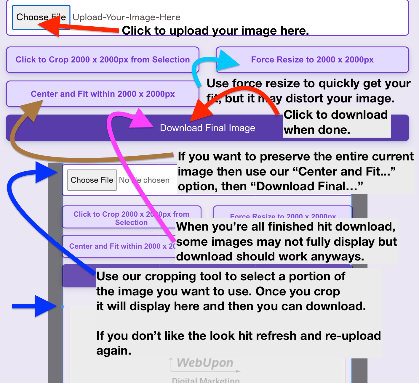
Instructions on Using the Tool
Dive into the world of tiny pictures, where a simple 72 x 72 pixel image becomes a giant! Think about it like a tiny, perfect square that fits everywhere on screens, from your smartphone to your laptop. For folks who make apps and websites look good, these small squares are super stars. Imagine each pixel as a dot of paint. The more dots you squeeze into a tiny space, the sharper your picture looks. So, if you’re curious about making crisp icons that pop out no matter where you see them, stick around. You’ll discover secrets that could turn your designs from meh to wow! Why should you keep reading? Because mastering these tiny titans could make your digital projects shine like never before!
Resolution and pixel density are fundamental concepts in digital graphics that often interplay with each other. The resolution of an image determines the amount of detail, whereas the pixel density, measured in pixels per inch (PPI), affects the quality of the image when resized or displayed on different devices. A 72 x 72 pixel image typically has low pixel density and is best suited for web graphics where high resolution is not paramount. Crafting a 72px x 72px photo involves a straightforward process of image resizing, which can be executed through various graphic editing tools or specialized image converter software, ensuring the final graphic retains optimal quality for its intended use.
Pixel by pixel, as we dive into the intricacies of converting images to a 72 x 72 pixel size, it’s vital to remember that the key lies in balancing the resolution and pixel density to achieve the desired quality. Adjusting the dimensions, without distorting the core visual data, requires tactical consideration—whether it’s for sharpening the icons on a mobile app or perfecting the thumbnail of a profile image.
Key Takeaways
- A 72 x 72 pixel image is ideal for icons with a perfect square ratio and low pixel density.
- Image quality and resolution are imperative for clarity and detail in digital graphics.
- Resizing images to specific dimensions requires precision to maintain image integrity on various devices.
Understanding Image Basics
In tackling the essentials of image handling, we focus on understanding the specific aspects such as resolution, pixel density, and image ratios. We also demystify the various image formats and their applications, ensuring clarity in how a 72px x 72px image is created and used.
Resolution and Pixel Density
Resolution refers to the amount of detail an image holds, often measured in pixels for digital images. For example, a 72px x 72px resolution means the image is 72 pixels wide and 72 pixels tall, giving us a total of 5,184 pixels. Pixel density, on the other hand, is the number of pixels within a given area of an image, typically per inch (PPI). Higher pixel density translates to greater image detail and sharpness.
Image Ratios Explained
The image ratio, or aspect ratio, is the proportional relationship between an image’s width and height. A 72px x 72px image has a 1:1 ratio, meaning it’s perfectly square. Different ratios like 4:3, 16:9, or 3:2 are commonly used in various devices and media formats, affecting how an image is displayed or printed.
Understanding Image Formats
Different image formats serve diverse purposes. Formats like JPEG or JPG are ideal for photographs due to their balance of quality and file size, while formats like GIF and WebP support animation. PNG is preferred for images requiring transparency. BMP is a simple format with large file sizes and no compression, and TIFF offers high quality for professional printing. SVG, ICO, and other vector image formats excel in images that need to scale without losing quality. Each format has intrinsic properties that define their use, such as compression levels, color depth, and compatibility.
Step-by-Step Guide to Resizing Images

When we need to resize images to a specific dimension like 72px x 72px, it’s essential to maintain the quality while achieving the correct size. Here, we’ll guide you through the processes using various methods.
Using Online Tools
For swift and straightforward resizing, online image resizers are an excellent choice. Here’s how we can resize an image to 72px x 72px using an online tool:
- Visit a reputable online image resizer.
- Upload the image you wish to resize.
- Enter
72in both the width and height fields to set your desired dimensions. - Optional: Use an aspect ratio calculator if you need to maintain the aspect ratio.
- Click the resize button to process the image.
- Download the resized image once the process is complete.
This method is typically free and doesn’t require any software installation.
Software Solutions for Resizing
If we need more control over the resizing process, using a software program like Adobe Photoshop (PS) might be preferable. Here’s a condensed guide:
- Open the image in PS.
- Navigate to
Image>Image Size. - Input
72in both the width and height boxes to set the new dimensions. - Ensure ‘Constrain Aspect Ratio’ is selected if you want to maintain the original aspect ratio.
- Press
OKto apply the changes. - Save the image with the new dimensions.
While software solutions like PS offer precision, they might not be free.
Adjusting Image Dimensions Manually
Sometimes, we need to adjust the image dimensions manually to get the perfect size:
- Open the image in a basic image editing program.
- Locate the resize or image size option.
- Type
72into the width and height fields for a 72px x 72px dimension. - If necessary, adjust the canvas size to add or remove background space, ensuring the aspect ratio remains intact.
- Save the image with the updated dimensions.
This manual method provides a basic, often free way to resize images without extra tools.
Optimizing Images for Different Devices

When preparing images for various devices, we must consider the specific requirements for web and mobile platforms, ensuring high image quality and appropriate aspect ratios to maintain a consistent user experience across all mediums.
Image Requirements for Web and Mobile
For web applications, images should be optimized for quick load times without compromising visual clarity—a balance of dimension and compression. Ideally, a 72 x 72 pixel image for web icons conforms to these dimensions: 72px in width and 72px in height, often representing the standard display on computer screens.
On mobile devices, dimensions vary significantly due to diverse screen sizes. For instance, an image that is 48×48 pixels in baseline resolution should be scaled to 72×72 pixels for high-density pixels (HDPI) screens, which is exactly 1.5 times the baseline size. This ensures images retain their quality and do not appear pixelated on devices with higher pixel densities.
Aspect Ratios Across Devices
The aspect ratio—the ratio of an image’s width to its height—is critical for displaying images properly on different devices. Common aspect ratios include 16:9 for widescreen displays, 4:3 for standard monitors, and 1:1 for square images often used for profile pictures and app icons. When optimizing images, we must ensure that the chosen aspect ratio fits the intended display area on the device. This prevents unnecessary image stretching or shrinking which could detract from user experience.
Whether working with computer screens or mobile devices, maintaining the correct aspect ratio ensures that our audience sees images as intended, providing a seamless visual experience free of distortions.
Advanced Topics in Image Conversion
When converting images, especially at a resolution of 72×72 pixels, understanding the intricacies of less common formats and optimization strategies is crucial for maintaining quality and managing file sizes.
Working with Less Common Image Formats
TGA, EPS, and EXR files often require special consideration due to their unique attributes. TGA files are valued for their ability to store a high quality alpha channel, useful for tasks requiring transparency. However, due to their larger file size, they are not commonly used for the internet or cloud storage, where bandwidth and storage space are at a premium. EPS files are vector-based, making them ideal for scaling without losing quality, and EXR files offer high dynamic range and deep color data vital for advanced visual effects work. For each of these formats, the key is to balance the demand for the highest quality with the practical limitations imposed by file size considerations and ISP upload/download capabilities.
Maximizing Quality While Reducing File Size
To ensure the highest quality of a 72×72 pixel image while minimizing file size, we apply compression techniques and format-specific optimizations. For instance, adjusting the percentage of compression in formats like JPEG, which balances quality with file size, is crucial. In lossless formats like PNG, the reduction of color depth can lead to smaller file sizes without significantly affecting visual fidelity. Additionally, we consider the end-use environment, whether it be a high-speed internet connection or constrained cloud storage, to determine the appropriate level of compression. The goal is to strike an optimal balance that maintains the integrity of images while facilitating efficient storage and transfer.

