Originally posted on March 25, 2024 @ 1:44 am
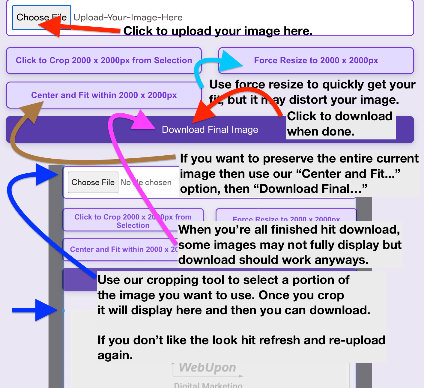
Instructions on Using the Tool
When it comes to digital images, understanding the specifics of resolution and pixel dimensions is crucial. A 1280 x 800 pixel image represents a specific aspect ratio and number of total pixels which directly relates to the quality and clarity of the image. The ratio between the width and height of an image is vital in maintaining the integrity of the visual content when scaling for various applications. As we delve into pixel density, we find it measures the concentration of pixels on a display and is critical for ensuring image sharpness, especially on high-definition screens.
Our journey through image resolution and optimization doesn’t stop there. Converting and resizing images to a specific pixel dimension like 1280px by 800px requires a clear understanding of how the process affects the final quality. This is particularly relevant for web and social media where image load times and visual clarity are paramount. As we look into the process of conversion, we aim to maintain the perfect balance between crisp, clear images and efficient web performance.
Key Takeaways
- A 1280 x 800 pixel image corresponds to a specific aspect ratio essential for maintaining image integrity.
- Pixel density is a key factor in the clarity and sharpness of an image on various display screens.
- Proper conversion to the desired pixel dimensions is crucial for striking a balance between image quality and web performance.
Understanding Image Resolution and Quality
Before diving into the details, it’s important for us to understand that the resolution of an image is a key factor in its quality, and pixel density plays a significant role in how an image appears on various devices.
Image Resolution Explained
Image resolution refers to the number of pixels that make up an image. It is usually represented by the width and height of the image in pixels. For instance, an image with a resolution of 1280×800 pixels means it is 1280 pixels wide and 800 pixels high. The more pixels an image has, the higher the resolution and the more detailed the image will be. It’s essential to choose the right resolution depending on the intended use to maintain clarity and detail.
- High Resolution: Typically above 1920×1080 pixels; ideal for printing and high-definition displays.
- Medium Resolution: Around 1280×720 pixels; suitable for web usage and moderate-quality prints.
- Low Resolution: Usually below 800×600 pixels; used mainly for quick loading on websites or thumbnails.
Determining Image Quality
The quality of an image is influenced by factors such as resolution, pixel density, and physical dimensions of the printed image. Pixel density, measured in pixels per inch (PPI) or dots per inch (DPI), describes the number of pixels within a physical area of the screen or print. A higher pixel density generally means a sharper image as there are more pixels packed into every inch.
- Pixels Per Inch (PPI): Describes the number of pixels in a digital image within one inch on a screen.
- Dots Per Inch (DPI): Often used interchangeably with PPI, but it is actually a printing term that refers to the number of printed dots contained within one inch of a physical print.
Using a PPI Calculator can help determine the appropriate PPI for a digital image based on its physical dimensions and the resolution. To ensure high quality, images intended for print should have a DPI of at least 300, while screen images generally require a lower PPI.
Table 1: Image Quality Indicators
| Factor | Description | Ideal Values |
|---|---|---|
| Resolution | Width and height in pixels | Higher for more detail |
| Pixel Density (PPI) | Number of pixels within a one-inch area of a digital image | 300 PPI for print; 72-150 PPI for screens |
| Physical Dimensions | Actual size of the image when printed or displayed on a screen | Depends on usage |
To sum up, both image resolution and pixel density are crucial aspects that affect the quality of a photo. Adjust these carefully to fit the requirement, whether it’s for print, web, or any other medium.
Aspect Ratios and Image Dimensions

When dealing with images, understanding aspect ratios and their corresponding dimensions is crucial for ensuring that photos display correctly across various devices and mediums.
Calculating Aspect Ratios
The aspect ratio of an image is the proportionate relationship between its width and height. It’s represented as two numbers separated by a colon, where the first number reflects the width and the second number signifies the height. To calculate the aspect ratio, we divide the width by the greatest common divisor (GCD) of both dimensions and do the same with the height. For example, an image that is 1280 pixels wide and 800 pixels tall has an aspect ratio of 16:10, as both numbers can be reduced by a factor of 80.
Standard Image Dimensions and Their Uses
The dimensions of an image, measured in pixels, directly dictate its resolution. Resolution refers to the amount of detail an image holds, and it’s often discussed in terms of pixel dimensions—for example, 1280px x 800px. Here’s a brief chart highlighting a few standard image dimensions and their common uses:
- 1024×768 (4:3): Suitable for standard computer monitors and projectors.
- 1280×720 (16:9): Ideal for high-definition video and widely used for web content.
- 1280×800 (16:10): Often used for widescreen computer displays and tablets.
Understanding these dimensions and the right aspect ratio is essential to maintain the integrity of an image when we use an aspect ratio calculator or manually adjust the size to fit different screens without distortion.
Converting Images to 1280 x 800 Pixels
We need to ensure that our images meet the specific requirements when we encounter the need to resize them to 1280px by 800px. This resolution is common for certain displays and web requirements. We’ll explore reliable online tools and provide a step-by-step guide to achieve this conversion.
Using Online Image Converters
The internet offers a plethora of free online image converters that are easy to use. These platforms allow us to convert our pictures to a desired size without needing to download any software. Here’s what we typically look for in these services:
- Privacy: We choose converters that respect our privacy by not storing images longer than necessary.
- Security: We opt for services that ensure secure image processing.
- Ease of Use: An intuitive user interface that simplifies the process of resizing images.
It’s crucial to select a resizer that maintains the quality of our images post-conversion while allowing us to achieve the desired 1280px by 800px resolution.
Steps to Resize Images Correctly
To resize images, we need to follow these specific steps:
- Upload the image to a reputable online image resizer.
- Input the desired resolution: 1280px width by 800px height.
- Choose the appropriate scaling options to maintain the aspect ratio if necessary.
- Review any available options, such as the ability to adjust the pixel density or the quality of the converted image.
- Download the converted file and check that the image meets the pixels requirement and retains the clarity we need.
By adhering to these steps, we can effectively scale our images to the exact specifications required with minimal effort.
Optimizing Images for Web and Social Media
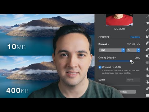
When preparing images for web and social media, we aim for optimal image quality while keeping file sizes manageable. Choosing the right file format and adjusting images for specific platforms are crucial steps.
Choosing the Right File Format
To ensure images look their best on the web and social media, we consider file formats that balance quality and file size. Here are some common formats:
- JPEG: Best for photographs and images with gradients. JPEGs offer a good balance of quality and file size, which can be adjusted through compression levels. However, JPEGs lose some quality each time they are saved.
- PNG: Ideal for images with text, sharp edges, or transparency. PNGs provide higher quality but can have larger file sizes, especially for high-resolution images.
- WebP: A modern format that provides excellent compression and quality, often better than JPEG and PNG. It is supported by many, but not all, web browsers.
- SVG: Best for logos, shapes, and graphics. SVG files are vector-based, so they scale without losing quality, making them suitable for responsive web design.
- ICO: Specifically used for website favicons, ICO files can contain multiple sizes within one file for different contexts.
Using a reliable converter can help us switch between these formats, ensuring we use the best one for our needs.
Adjusting Images for Social Media Platforms
Each social media platform has its own preferred image dimensions and aspect ratios. Here’s a brief guide:
- Facebook: For profile pictures, the recommended size is 170×170 pixels on desktop and 128×128 pixels on mobile devices. Cover photos should be 820×312 pixels.
- Instagram: Square photos should be 1080×1080 pixels. For profile pictures, 110×110 pixels is the guideline, and Instagram Stories require 1080×1920 pixels.
Cropping images to fit these dimensions ensures they display correctly. Using graphic editing tools, we can crop, adjust file size, and tweak the resolution. A high-resolution photo, for instance, can be resized to 1280×800 pixels, maintaining a 16:10 aspect ratio, for a tidy display on a variety of screens. We must also consider pixel density, especially when images are viewed on mobile devices with higher resolutions, to keep our images crisp and engaging.

