When talking about image resolutions and conversions, it’s essential for both professionals and hobbyists to grasp the specific terminology and procedures. A frequently encountered resolution is 1024×768 pixels, which is commonly linked to the XGA (Extended Graphics Array) standard displays. This resolution provides a 4:3 aspect ratio, which used to be the norm for computer screens and projectors before widescreen formats gained popularity. Our objective when handling images might often be to adjust different image sizes to this specific resolution without sacrificing image quality, guaranteeing that our graphics appear sharp and clear on all devices that support this resolution.
To create a 1024px by 768px photo, several important factors come into play: the ratio, resolution, and pixel density. The ratio indicates the proportional relationship between the width and the height of the image. Resolution is the detail an image holds, and pixel density refers to the concentration of pixels on a display, affecting the sharpness of the image. When optimizing images for both web and print, careful adjustments to these parameters are necessary to maintain high-quality visuals. This often involves using a reliable image converter that can handle these attributes correctly without causing distortion or quality loss in the image.
Key Takeaways
- 1024×768 pixels offers a standard 4:3 ratio, aligning with the XGA standard.
- Converting images to this resolution requires attention to ratio, resolution, and pixel density.
- Image quality is preserved by using proper conversion tools designed for 1024×768 pixels.
Understanding the Basics
As we explore the 1024 x 768 pixel image converter, it’s essential to grasp how the resolution, aspect ratio, and pixel density relate to image quality.
Resolution and Image Quality
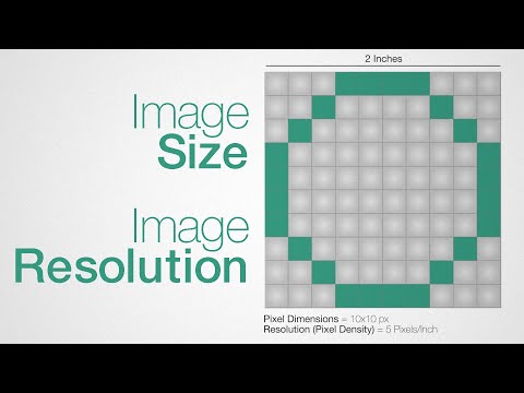
Resolution is a term that refers to the number of pixels that compose an image, typically represented as width x height. For a 1024 x 768 image, this means there are 1,024 pixels horizontally and 768 pixels vertically, yielding a total of 786,432 pixels. Image quality is impacted by the resolution; higher resolution often correlates with higher detail and clarity up to a point, depending on the display device or print size.
| Dimension | Pixels |
|---|---|
| Width | 1024px |
| Height | 768px |
When we resize an image to different dimensions, maintaining quality can be challenging. If we increase the size beyond the original dimensions (upscale), we risk losing quality, as the pixels are stretched to cover a larger area without adding additional detail.
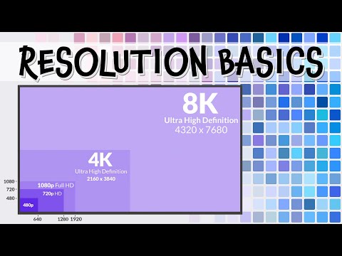
Aspect Ratios and Standards
The aspect ratio represents the relationship between the width and height of an image. For a 1024 x 768 image, the aspect ratio is 4:3, which was once the standard for monitors and TVs before the wide adoption of the 16:9 ratio. Different aspect ratios suit different purposes:
- 4:3 – Traditional TV, computer monitors, standard photography print size.
- 16:9 – Modern widescreen TVs, monitors, and online video content.
- 1:1 – Typically used for social media profile pictures, app icons.
- 16:10 – Common in computer displays, offering a bit more vertical space than 16:9.
To maintain the image’s original aspect ratio while resizing it, we use an aspect ratio calculator or employ a formula that applies the same factor to both width and height dimensions.
| Aspect Ratio | Common Use |
|---|---|
| 4:3 | Old monitors/TVs |
| 16:9 | Modern screens |
| 1:1 | Social media |
| 16:10 | Computer displays |
Conversion Process

Converting an image to 1024 x 768 pixels involves adjusting its dimensions to a specific width and height. We aim for clarity and quality while choosing an appropriate format for our needs.
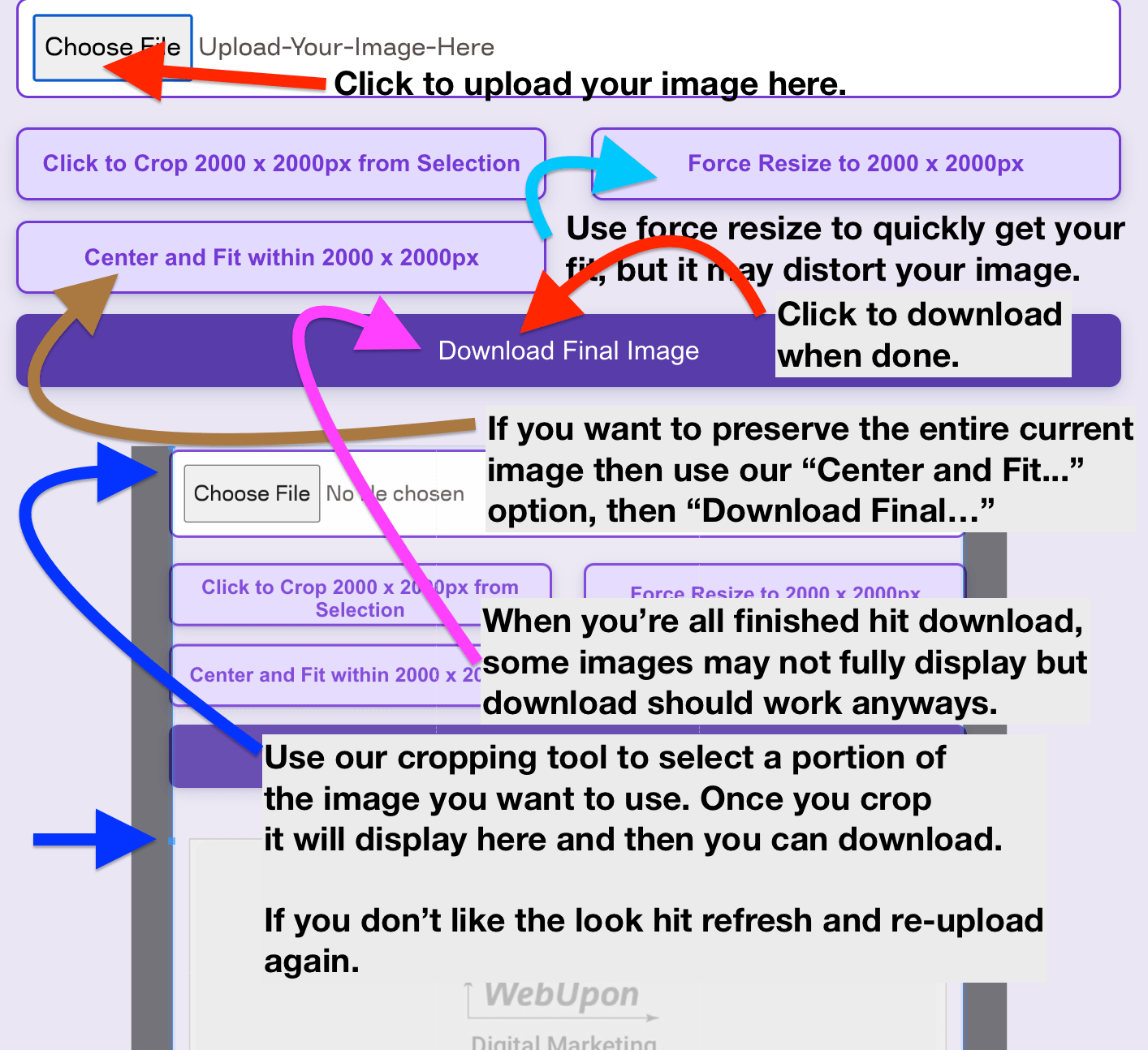
Step-by-Step Conversion Guide
-
Select Image: First, we need to choose the image that we want to convert.
-
Upload: We then upload the image to a free image converter that supports various image file formats such as JPG, PNG, WEBP, GIF, TIFF, BMP, and SVG.
-
Resolution Settings: In the converter, we specify the target resolution—1024 pixels in width by 768 pixels in height.
-
Aspect Ratio: To maintain the quality of the image, it’s important to preserve the original aspect ratio. If necessary, we can crop or add padding to the image to fit the desired resolution without distortion.
-
Conversion: After setting the parameters, we convert the image. The converter should allow us to resize the image and change the format if needed.
-
Download: Once the conversion process is complete, we can then download the converted image to our device.
Selecting the Right Image Format
-
Quality and Use: Each format offers different advantages; for instance, JPG is ideal for photographs due to its balance of quality and file size, whereas PNG is better for images requiring transparency.
-
File Size: If the image is for web use, we might opt for WEBP, which often provides smaller file sizes with little to no loss in visual quality.
Utilizing the proper image format is crucial to ensure that the converted image meets our specific needs, whether for web, print, or archival purposes.
Optimizing for Web and Print
When preparing images for web and print, we must consider the balance between maintaining high image quality and managing file size for efficient loading and printing.
Balancing Quality and File Size
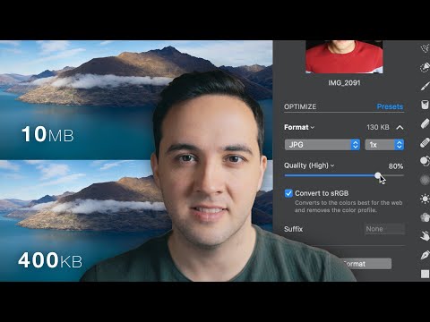
When resizing images, specifically to a 1024px x 768px size, we should use a pixels to print size calculator to ensure that we maintain the right physical dimensions without losing quality. For web use, keeping the file size smaller, typically under 2 megabytes, helps images load faster, crucial for maintaining a good user experience. We often employ compression tools that reduce file size but can also affect image quality if not used carefully.
For print, the resolution, usually measured in pixels per inch (ppi), needs to be higher to avoid a grainy appearance. A ppi value of 300 is the standard for high-quality prints. However, when images are only displayed on the internet, a lower ppi is acceptable since monitors generally have a lower pixel density.
Converting an image to black and white can also reduce file size. This is because color images contain more data than black and white ones, which can be an advantage when we aim to reduce the file size for the web without significantly impacting quality.
Medium also plays a role in optimization. For instance, a high-resolution image might be necessary for a large print poster but would be overkill on a webpage, potentially slowing down the loading time.
It’s our job to strike the right balance to ensure images are viewed in the highest quality possible given the constraints of the medium, thereby achieving the best conversion rate and user engagement while also managing the angle and aspect ratio to prevent distortion.
Additional Considerations
When converting images to a 1024 x 768 pixel format, we must not only focus on the image quality or dimensions. It’s crucial to address the pixel density for print quality, maintain privacy and security throughout the process, and ensure compatibility and accessibility across different platforms and devices.
Understanding Pixel Density
Pixel density, measured in pixels per inch (PPI), is vital when resizing an image for print. A higher PPI generally means better image quality because more pixels can fit into a given area. To calculate the print size of a 1024×768 pixel image, use a pixels to print size calculator to get accurate dimensions without losing quality. A typical computer display has a pixel density of 72 to 96 PPI, but for high-quality prints, a PPI of 300 is standard.
Maintaining Privacy and Security
During the conversion process, our images may pass through various Internet Service Providers (ISPs) and servers, potentially exposing them to unauthorized access. It’s our responsibility to protect our data. Utilize secure and free image conversion tools that prioritize privacy. Moreover, always ensure that the files are transferred over encrypted connections and consider watermarking to safeguard against unauthorized use.
Compatibility and Accessibility
Convertible images must be understandable and visible to everyone, including individuals with disabilities. A 1024×768 image should be checked for compatibility with both Windows and Mac systems. Different image file formats, such as BMP, SVG, WEBP, and GIF, offer varying degrees of quality and accessibility. For example, SVG files are ideal for web use due to their scalability without quality loss, while BMP files are uncompressed and retain high quality but at a larger file size. Additionally, ensure that the images are easily accessible and render well on all screens, regardless of the device’s display capabilities.

